We’re busy gearing up for our talk to TYPO Berlin at 7pm on Thursday May 15th in the main hall of the wonderfully named Haus der Kulturen der Welt (The House of World Cultures, AKA the ‘pregnant oyster’ to Berliners). We’re still dotting is and crossing ts but can reveal our theme will cover design systems and visual engineering, and we promise to use the term ‘parametric’ only once each.

Fonts in Use have featured FF ThreeSix in the signage graphics designed for Massey University’s Exposure 2011 exhibition by Thomas le Bas.
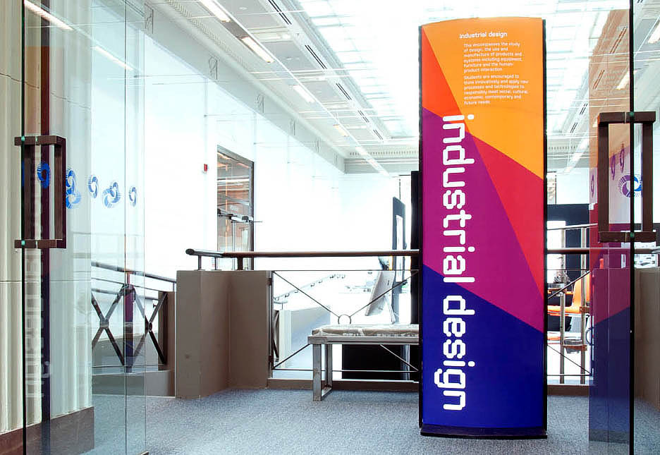
The Porto Design Summer School Editorial Course is a unique opportunity to study graphic design within the setting of one of Europe’s oldest and most beautiful cities. Focusing on editorial design and typography, this intensive two week practice-based course also pays special attention to the city’s rare heritage in vintage shop signage and other forms of vernacular lettering.
Under the expert guidance of course tutors Jessica Helfand, Andrew Howard and Hamish Muir, participants will explore the creative possibilities of editorial design, examining topics such as narrative structure, navigation, typographic systems, hierarchy and composition, as well as editing and notions of authorship.
The course leads to a practical outcome for each participant in the form of an individual editorial project that develops personal interests and that draws inspiration from the city. The aim is to expand technical and conceptual skills and thus move participants closer to finding a unique outlook and signature as a graphic designer.
The two week programme will culminate with individual presentations of the projects in a collective critical review by fellow participants, tutors and invited guests.
Above all, the course establishes an intensive, creative forum within which to discuss approaches to contemporary design practice, to share ideas with colleagues and tutors alike, and to celebrate collective interest and enthusiasm.

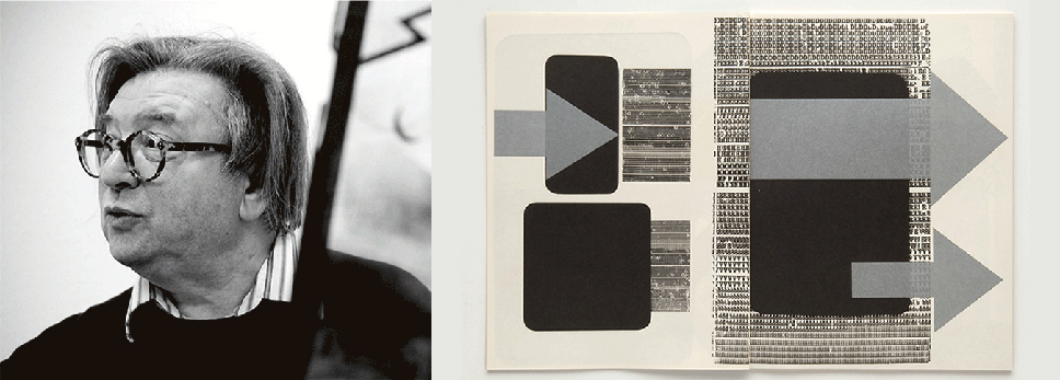
This long awaited retrospective, which opens at the MfG in May, is the first major exhibition of Weingart’s work to be staged in Switzerland. At the boundaries of analogue and digital, his work still has profound significance. The photomechanical layering / montage techniques that Weingart developed culminated in a unique synthesis of type and image in the late ’70s – this had a hugely significant impact on the development of graphic design in the late 20th century.
Aside from a comprehensive survey of Weingart’s work, the exhibition will document his teaching during more than thirty years at the Basel School of Design. As part of its educational programme, the MfG is staging a series of talks during the exhibition; as a former student of Weingart, Hamish Muir, co-founder of MuirMcNeil, will be in conversation with the exhibition curator, Barbara Junod, in a gallery talk ‘The Process as Illumination’ on Wednesday 25 June 2014 at 18.00.
Weingart Exhibition, Gallery Talks
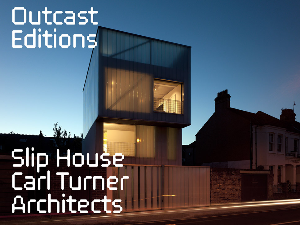
Outcast Editions have newly published their single building architecture monographs as iBooks for iPad and Mac. FF ThreeSix 10 was selected as the typeface for these publications as it is particularly well-suited to retina screen display – its 8 subtly modulated weights which share the same central contour, allow for the optimisation of readability by type weight against different background colours and textures, without affecting the set length of type.
Slip House, Carl Turner Architects
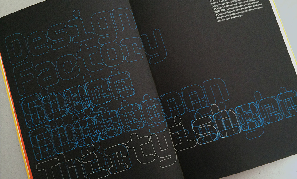
MuirMcNeil’s contribution to Design Factory’s thirtieth anniversary publication launched by DF founder Conor Clarke at the ‘Thinking + Typography’ evening at the Smock Alley Theatre, Dublin, 03 April 2014. Typeset in Nine Mono 162 (outlined), the composition is driven by a simple system that overlays One – Ten; Eleven – Twenty; Twenty-one – Thirtyish on three lines. MuirMcNeil Nine is available to buy from our online shop.
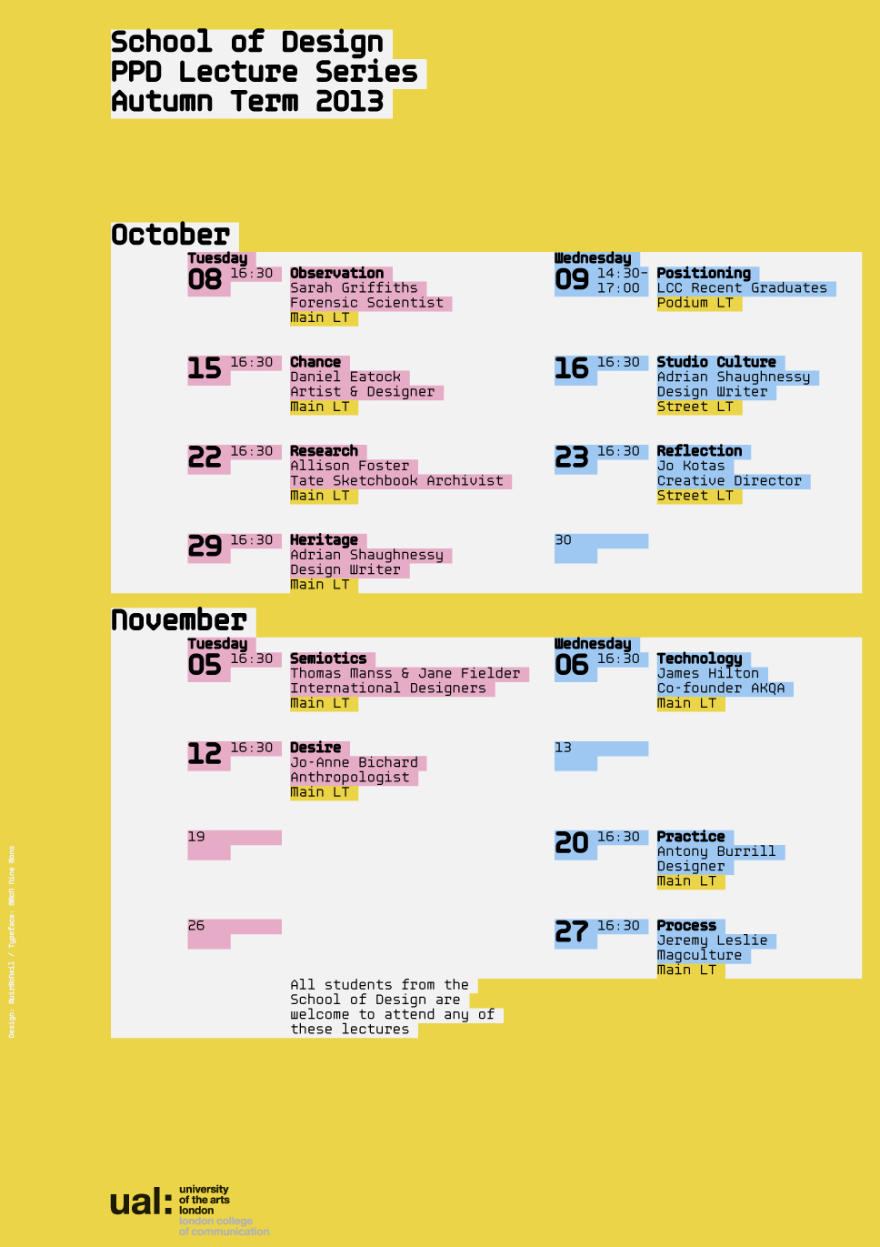
Poster for the autumn lecture programme at the LCC School of Design 2013 designed by MuirMcNeil – a pre-release live test for Nine Mono.
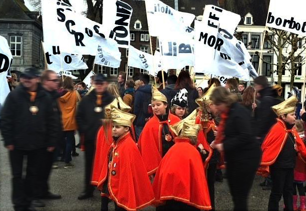
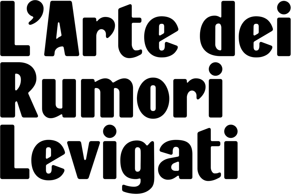
Rumori is a typeface designed by Paul McNeil for a project by designers Paul Bailey and Yeb Wiersma. In February 2014, Bailey and Wiersma were commissioned to republish Luigi Russolo’s Futurist Manifesto ‘L’Arte dei Rumori’ on the occasion of its 100th anniversary. The new publication was planned as a procession of Russolo’s texts applied to banners on buildings in Maastricht, Holland, and on signs carried by a group of participants walking its streets.
Using the titling from the cover of the 1916 edition of Russolo’s manifesto, the challenge was to construct a complete alphabet from only ten reference characters. The Rumori typeface has been developed in three alternative versions: Chiari (clean and sharp), Levigati (soft) and Grezzi (roughened). The alternative cuts are intended to evoke the appearance of wood type printed on different paper surfaces and with varying pressure.
Contact MuirMcNeil for information and availability
The Institute of Designers in Ireland presents an evening of talks on design thinking and typographic design by Paul Hughes (Ten Meters of Thinking) and Hamish Muir.
3rd April 2014, 18.30
Smock Alley Theatre
Temple Bar
Dublin
Interact, designed by 8vo in 1994 for an invited submission to the American Center of Design ‘Interact’ CD-ROM, has now been extensively expanded and revised by MuirMcNeil. The Interact type system and a large-format silk-screened poster in 2 day-glo colours can be purchased from the MuirMcNeil online shop.