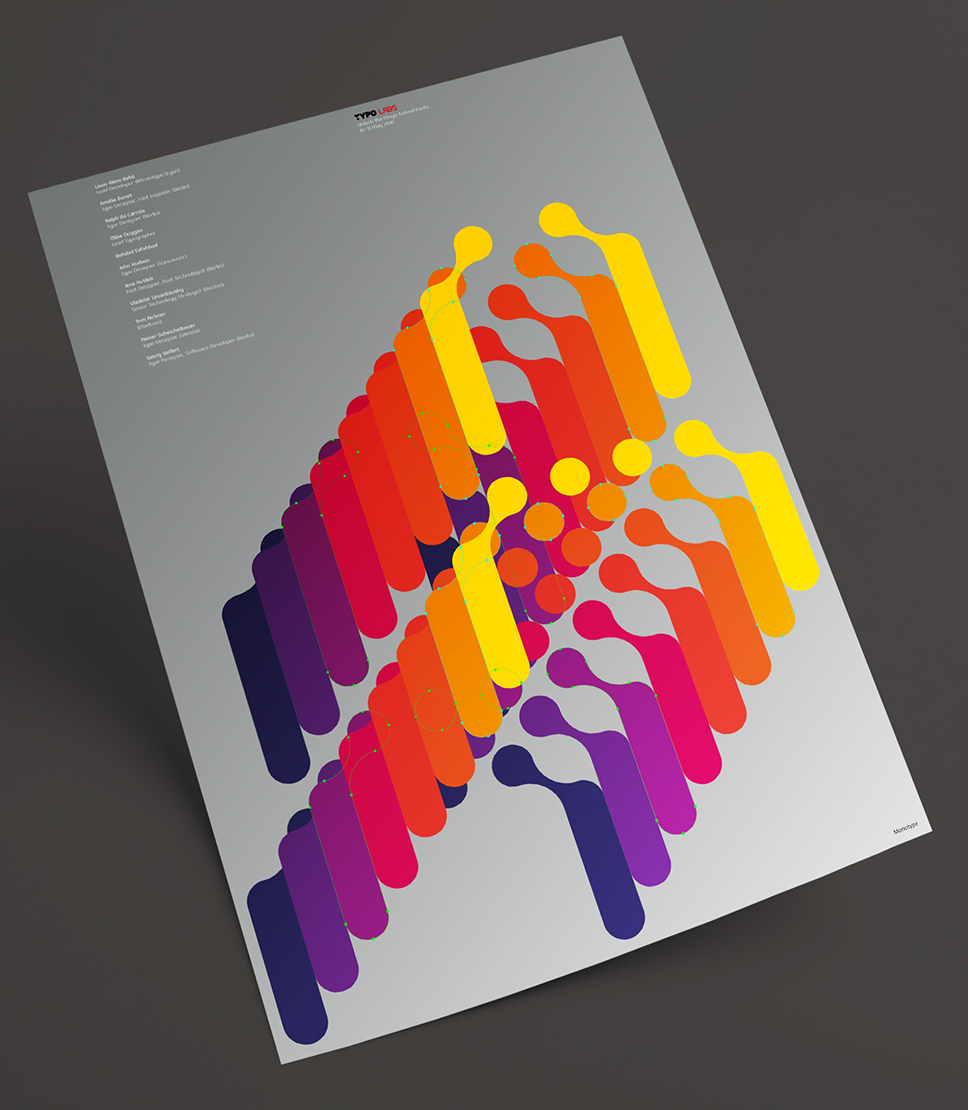
The identity for the first TYPO Labs font technology conference, an offshoot of TYPO Berlin, has been designed by Alexander Roth for FontFont using MuirMcNeil’s FF ThreeSix 30 type system.
MuirMcNeil have been invited by the Society of Typographic Aficionados to design the identity for TypeCon:2016 ‘Resound’ to be held in Seattle, WA, from 24–28 August. Here’s a small preview of our identity design – more to follow soon.
Society of Typographic Aficionados
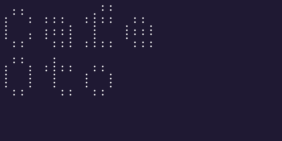
The directional offsets used in our identity for LCC Postgraduate Shows 2015 (see below) form the basis of animated GIFs for screen-based applications – the example shown here is for use on LCC’s flat screen information display system.
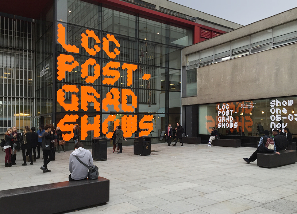
External signage, part of our identity for London College of Communication Postgraduate Shows 2015, has just been installed on site at the Elephant & Castle.
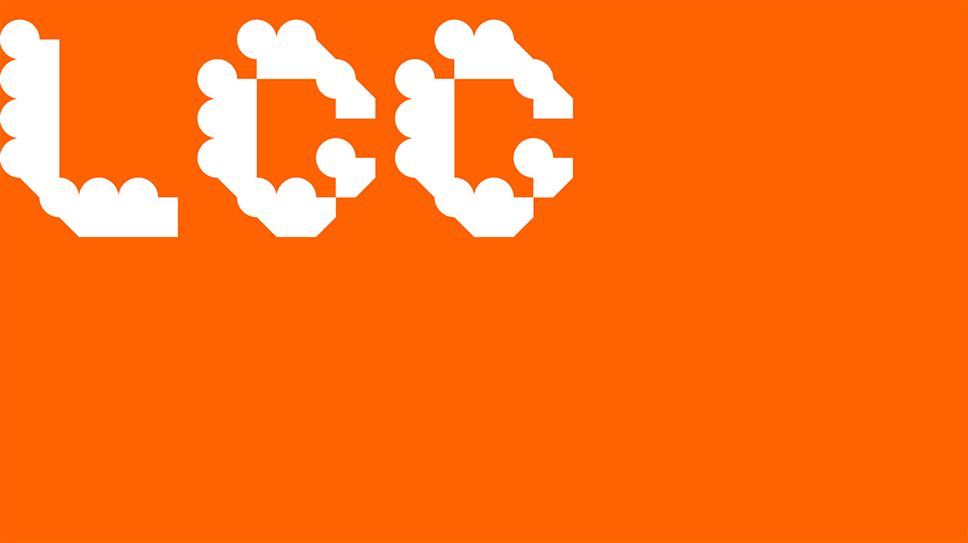
The core of the identity is built from two of the bespoke modular typefaces created for LCC Summer Shows, offset by the same interval in four directions (up/left; down/left; down/right; up/right) overlaid in the same colour for external signage (fluorescent orange and white) and in overprinted colours on printed items.
The identity will be featured in full on our site at a later date.
London College of Communication
To accompany the poster we designed for Russell Haswell’s Mini-Fest at Cafe Oto, London, we have developed this animated GIF with MuirMcNeil TwoPoint C for use in announcing the event on Twitter.
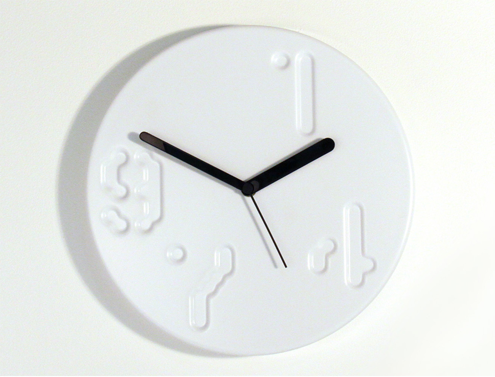
Designed by Chris Jackson and Nick Kapica, the ‘1974’ clock is made from 3mm ABS with custom 3D printed hands. The numerals 1; 9; 7; 4, which are part of the clock face, use MuirMcNeil’s FF ThreeSix 31. The typeface was chosen by the designers ‘for its geometric clarity and its visual similarity to the CNC cutting paths that informed design development’.
The 1974 clock can be purchased at the Northwards Design store.
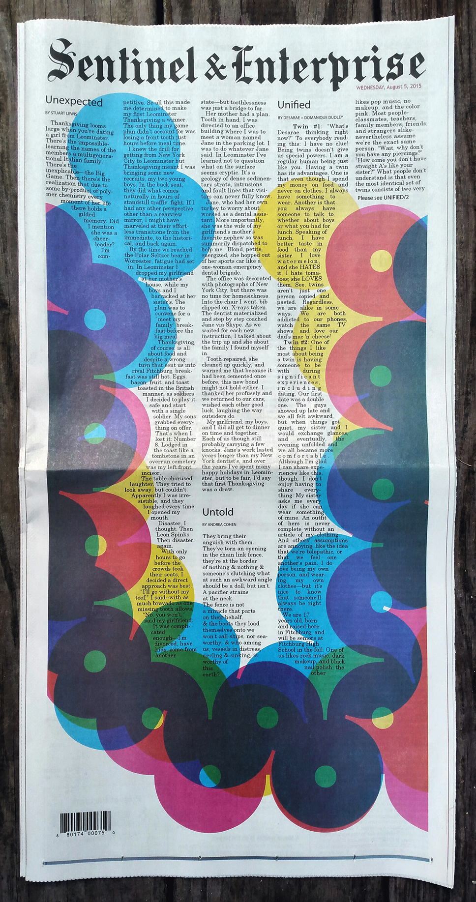
Catherine Griffiths has used MuirMcNeil TwoPoint for her ‘U’ on the front page of the Sentinel & Enterprise (Fitchburg, MA) daily newspaper ‘Alphabet Project’. Curated by artist Anna Schuleit Haber and commissioned by the Fitchburg Art Museum, the project ran from 13 July – 11 August 2015.
Twenty-six typographers were invited to contribute one original letter each to this project around which daily news and found urban stories are arranged.
Griffiths combined three TwoPoint ‘U’s – the magenta set upright, the yellow tilted one way, cyan the other, with the request that the newspaper avoided printing text over the magenta U.
‘This work of art is a limited-edition, daily experiment that explores visual language systems, the transport of text, and the shaping and meaning of news, both local and non-local. The project spans twenty-six days and highlights art, poetry, and news-stories that appear, not inside the paper but on its front page. The art is the newspaper, and the newspaper is the art.’ Fitchburg Art Museum.
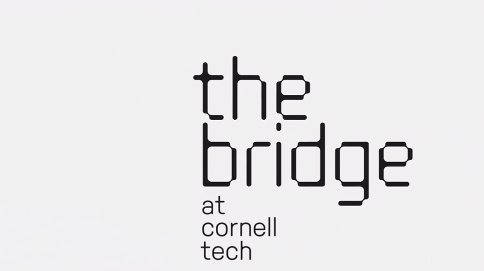
Michael Beirut and his team at Pentagram New York have used FF ThreeSix 10 for The Bridge at Cornell Tech logotype – seen here in a frame from a teaser video produced to announce this major campus development which is scheduled to open in 2017.
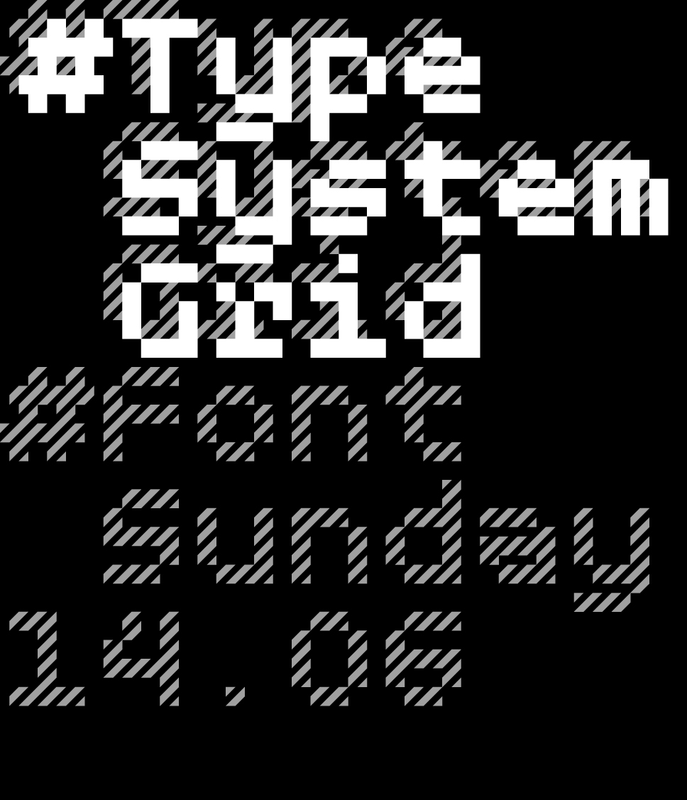
MuirMcNeil and London College of Communication have been invited by Design Museum to host #FontSunday on the theme ‘Type, System, Grid’. The focus will be on letters, words and texts as geometric units in the architecture of visual communication.
Twitter, Sunday 14 June 2015, 12.00–16.00
Our identity for London College of Communication Summer Shows is up and visible (in mirror finish) at the Elephant & Castle. The School of Media Show ran from 05–11 June, the School of Design Show will be open from 19–27 June.
We’ll be featuring the project in full on our site soon, but meanwhile you can read more in this article at designboom.
London College of Communication
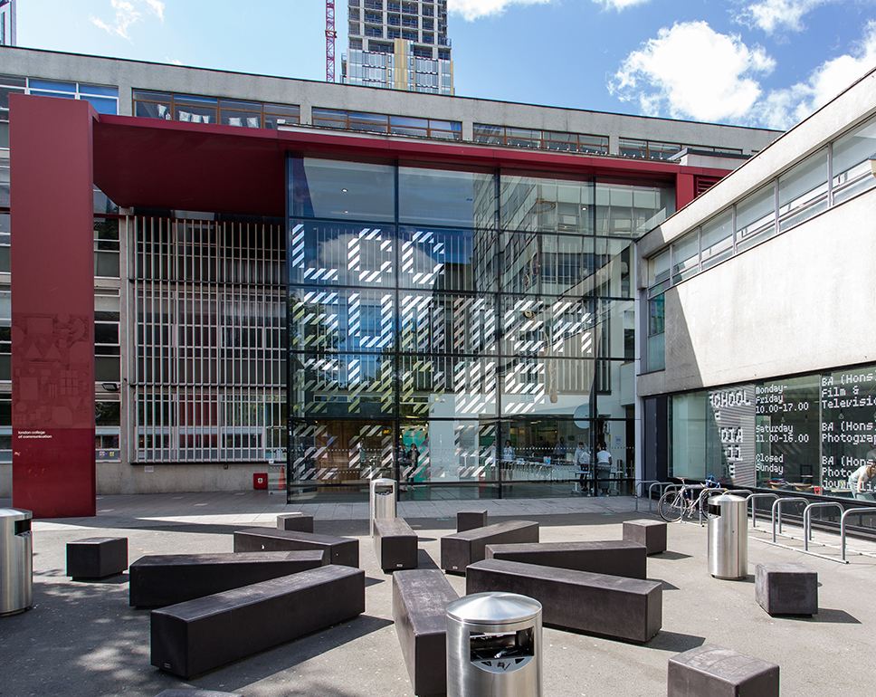
(Photo: Lewis Bush)
