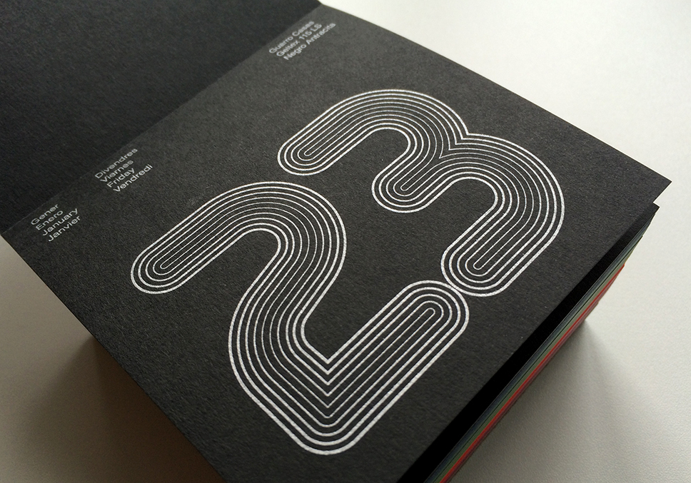
MuirMcNeil’s Nine Metric type system has been showcased in a 2015 promotional desk calendar for a paper manufacturer by Wladimir Marnich of Marnich Associates, Barcelona. The Guarro Casas 2015 calendar uses Nine Metric’s precise multilayering features to generate 365 individual settings printed in silver on a range of coloured papers.
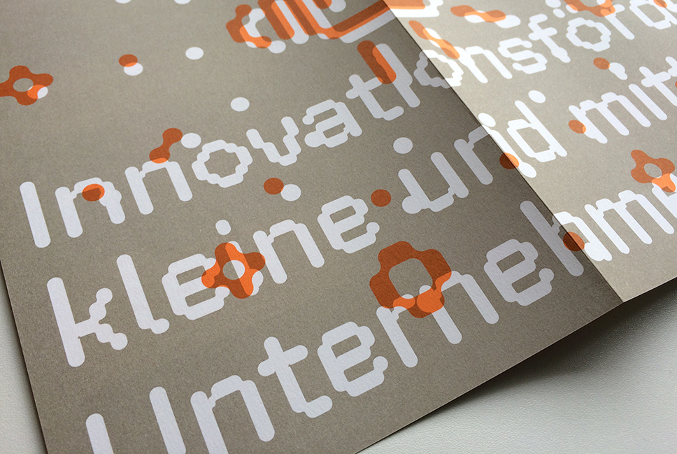
Nayeli Zimmermann and Thomas Le Bas of SV Associates Berlin have put FF ThreeSix 21 to excellent use in their A2 poster for KMU-kooperativ. We’re delighted to see how effective ThreeSix 21 is for reading at small sizes in extended text as well as for headlines.
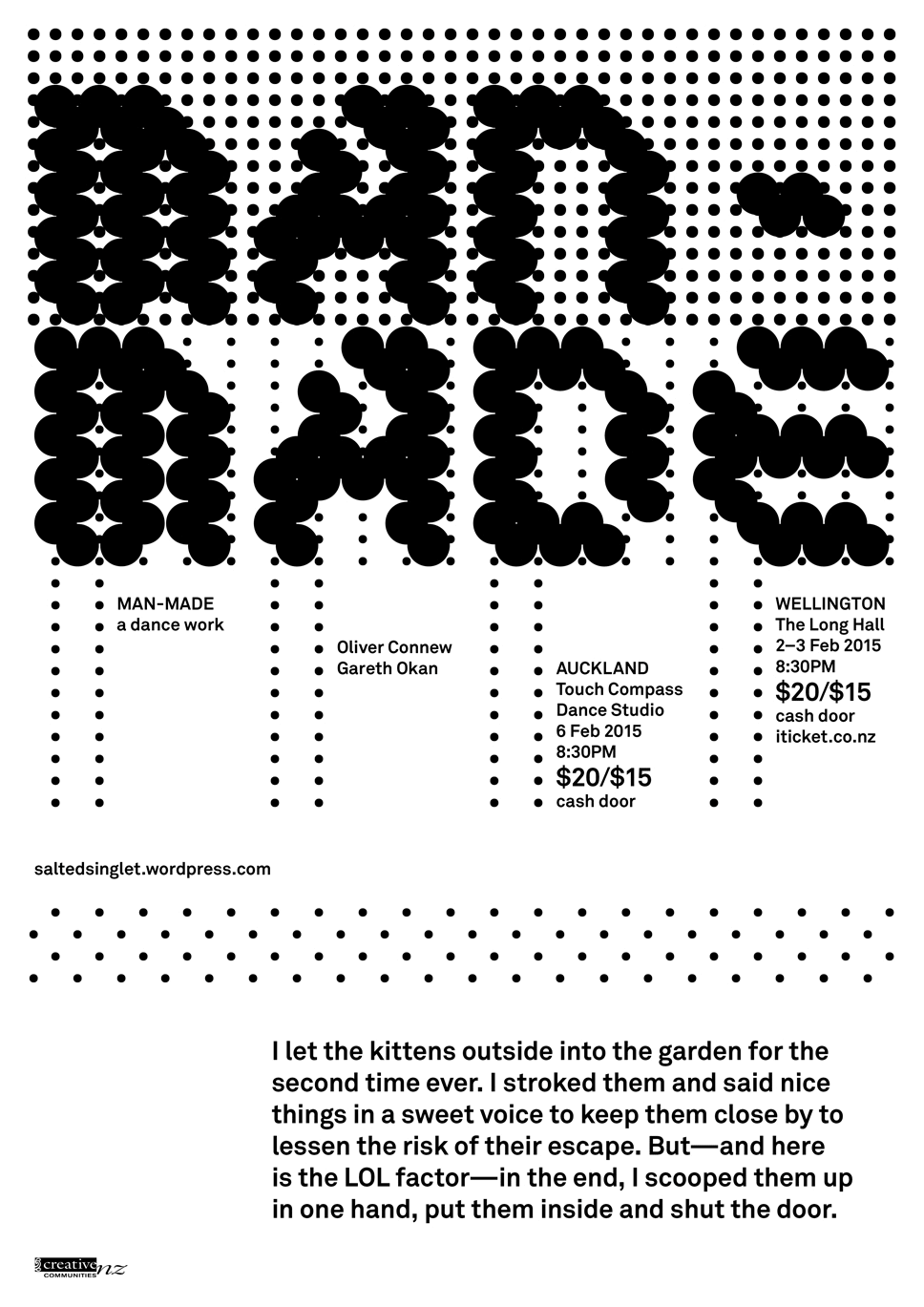
Catherine Griffiths has designed this poster / GIF using TwoPoint from MuirMcNeil (in combination with Akkurat from Lineto) to announce the performance of a new work from award-winning Berlin-based choreographer Oliver Connew which will be staged in Wellington and then Auckland, New Zealand, in early February 2015.
The design makes clever use of the animation potential inherent in TwoPoint (a common feature of all MuirMcNeil type systems).
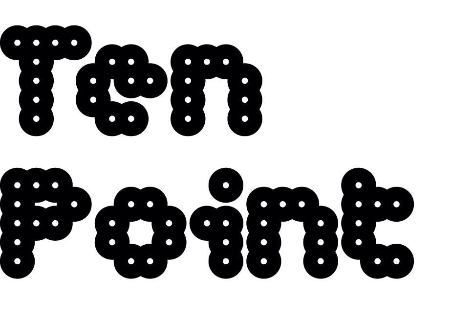
In a recent article for Design Observer, Robert Hetherington discusses MuirMcNeil’s TenPoint type system as ‘typographic units at the limits of alphabetic writing’.
‘MuirMcNeil’s fonts play with the ideas of what a typeface is and what it does. Through considering its various states of existence, from language to object to image, they always come back to the fundamental notion that the letter is dependent on its constituency and its relation to something else.’
‘Best article about experimental typography I’ve read maybe ever. All about @MuirMcNeil’s series of point-based fonts’ Christy Harrington @haychristyhay via Twitter
‘Great article from @RobertHeth about @MuirMcNeil’s TenPoint Type systems’ Daniel Marks @D_Marks_Design via Twitter
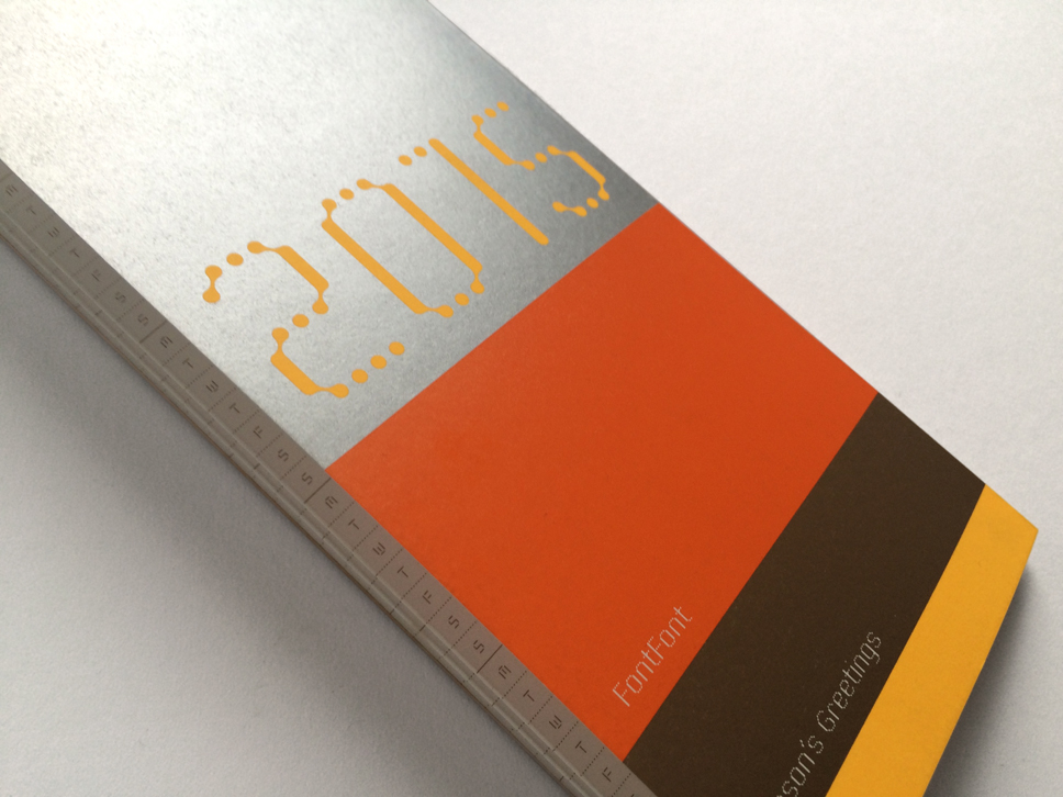
We’re absolutely delighted that FontFont have featured MuirMcNeil’s FF ThreeSix 30 typeface in their Season’s Greetings / 2015 agenda mailer.
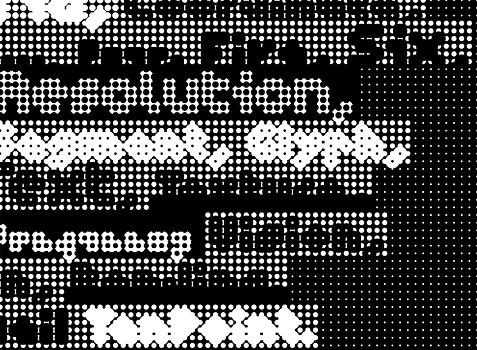
We are pleased to announce the release four new geometric type systems and an accompanying set of four limited edition silk-screened posters (in glorious black and white).
The type systems and posters are built solely with a common element – the circular dot. All of the new projects explore amplifying the dot at the same time as diminishing it to the lowest possible pitch; to the tipping point where it can no longer act as a carrier for any message except to communicate its own isolation.
The new typefaces and posters are now available from our online shop
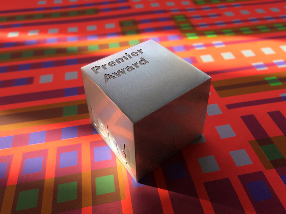
To add to our two ISTD awards for FF ThreeSix in 2011, the Panopticon, Intersect, Nine and Interact poster series received a coveted ISTD Premier Award at last week’s awards evening held at the magnificently modernist De La Warr Pavilion in Bexhill on Sea.
International Society of Typographic Designers
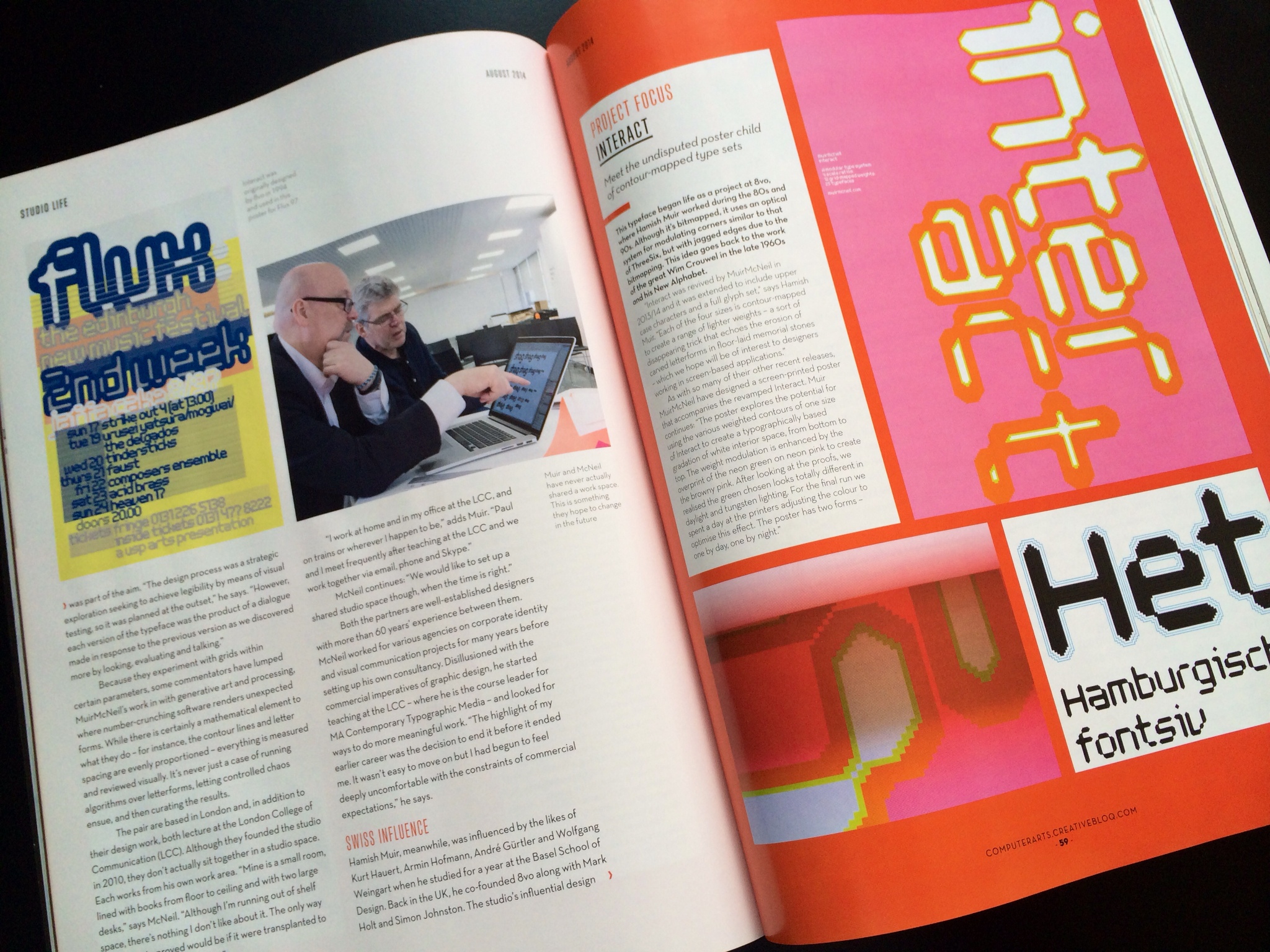
MuirMcNeil in conversation; ‘Studio Life’ section, Computer Arts, August issue.
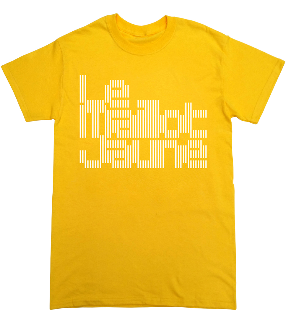
As part of the ‘Yorkshire in Yellow’ events for this year’s Grand Depart of the Tour de France, MuirMcNeil were invited to design a T-shirt for the ‘Maillot Jaune’ exhibition held at the Millennium Gallery, Sheffield (31.05–07.09.14). The T-shirt, which features MMcN Intersect, is available online at the Made North store.
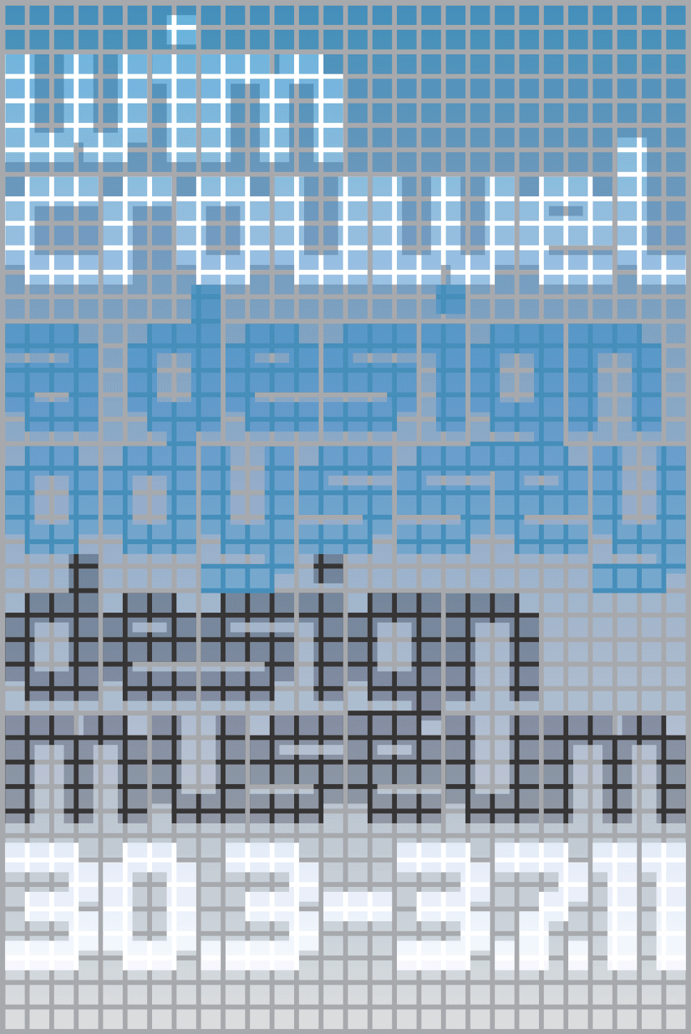
As part of our talk at TYPO Berlin we’ll be showing the development process for the poster MuirMcNeil designed for the Wim Crouwel exhibition at the Design Museum, London in 2011. Here are a few iterations on two themes from a total of around 300 designs. More will be shown in Berlin, but don’t worry, not all of them, and it’ll go very quickly.