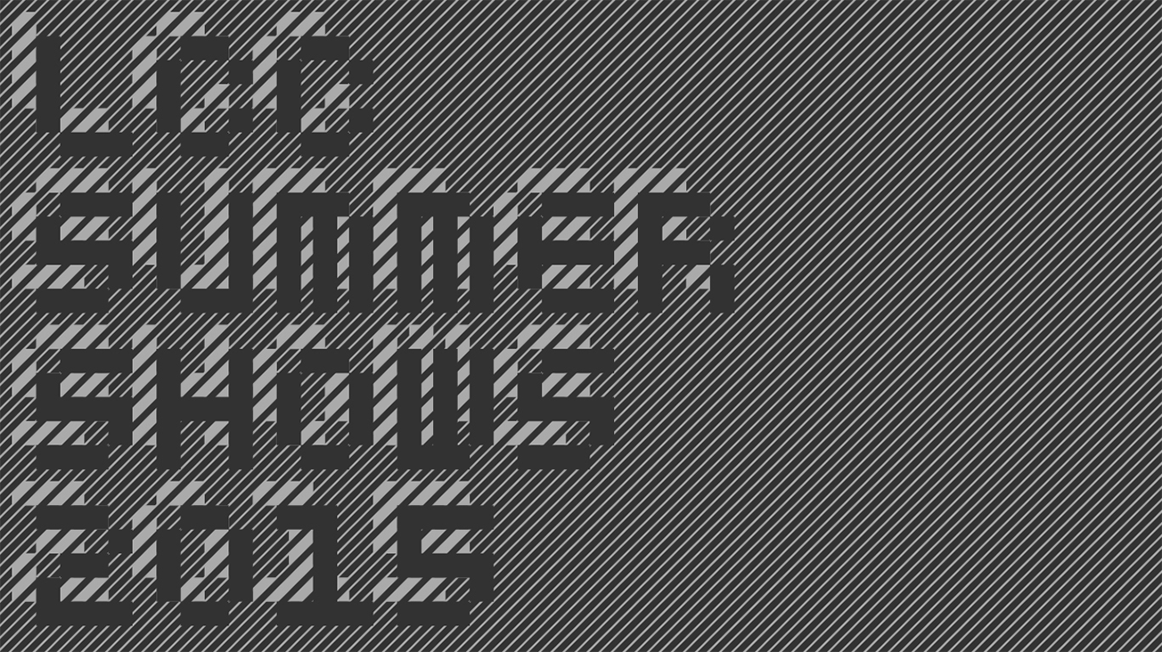
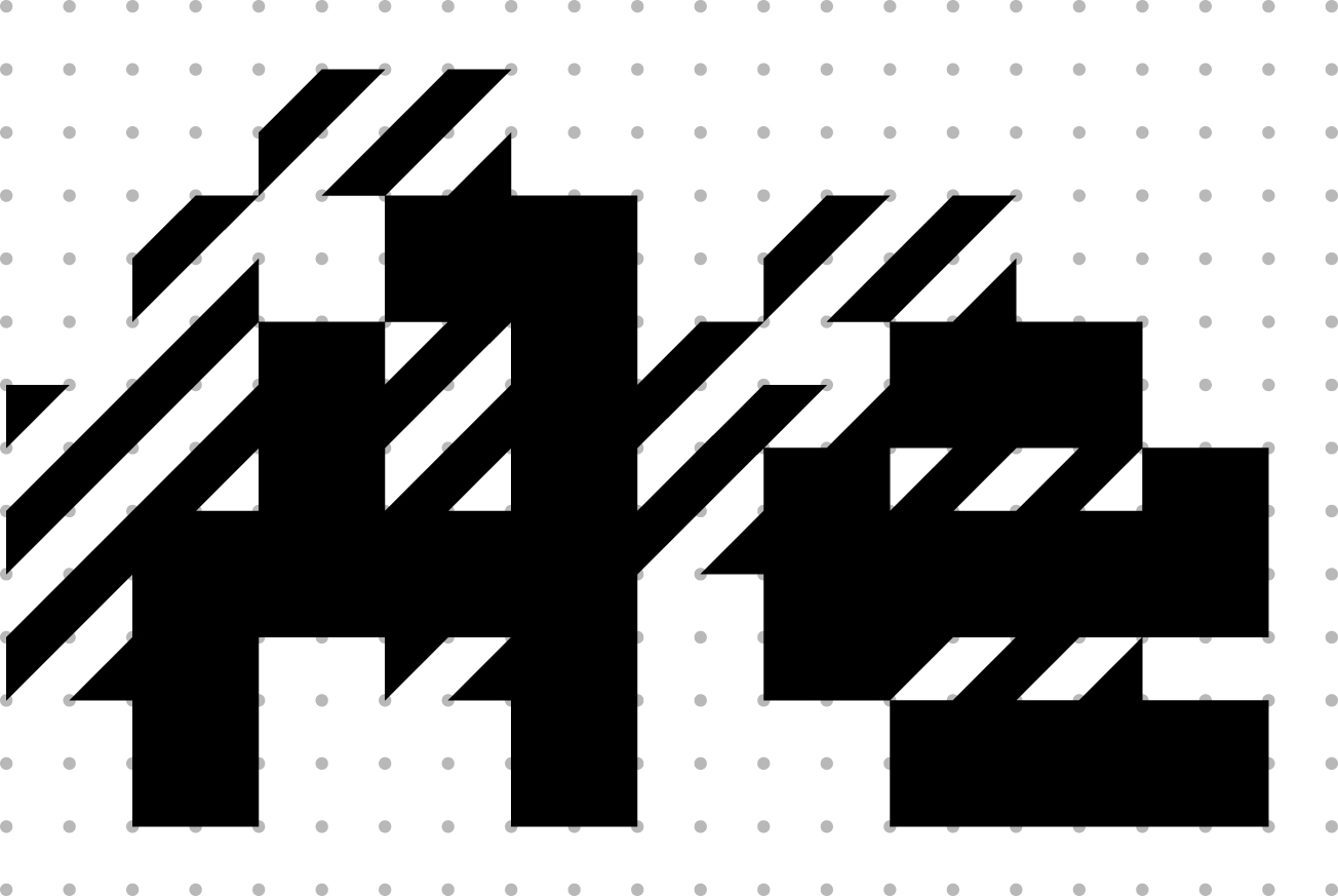
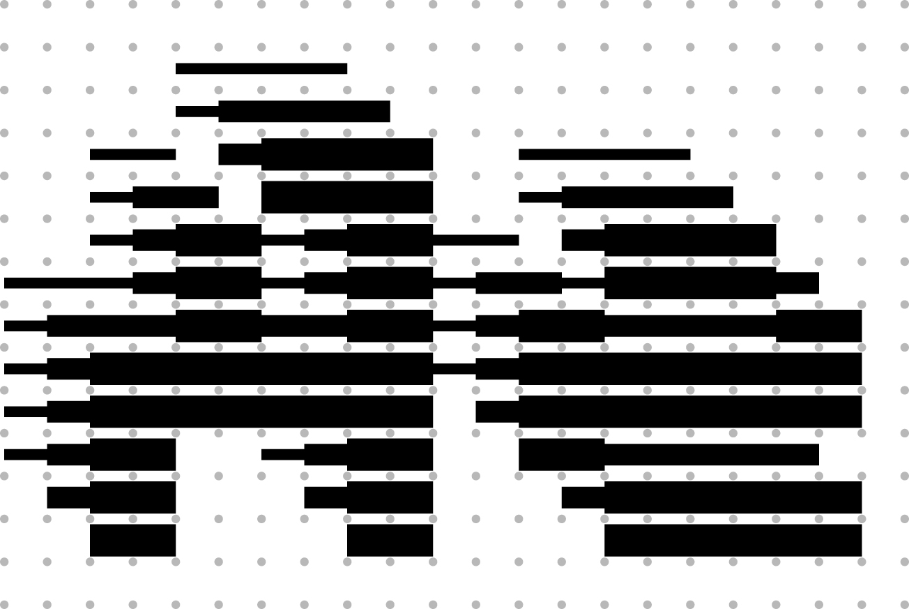
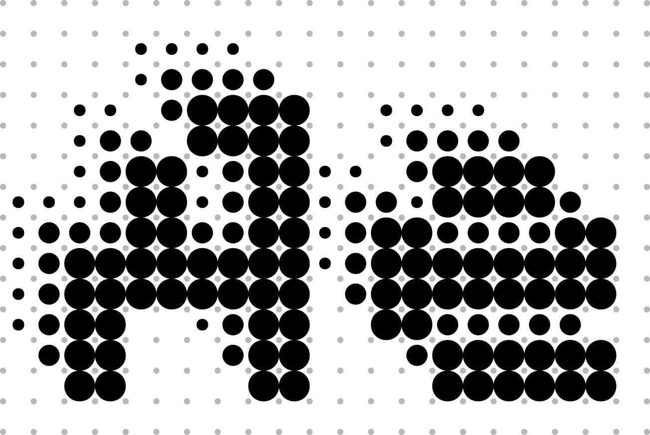
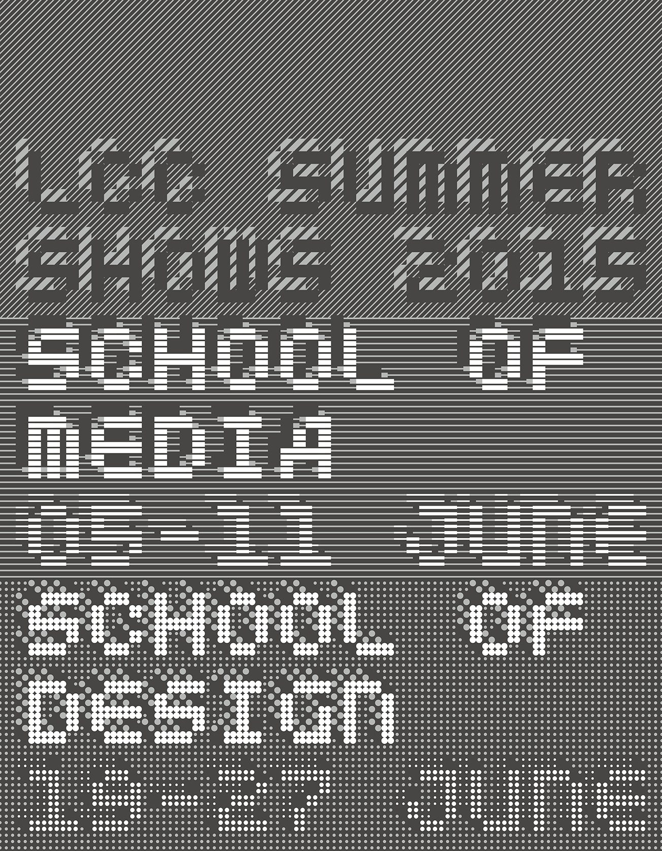
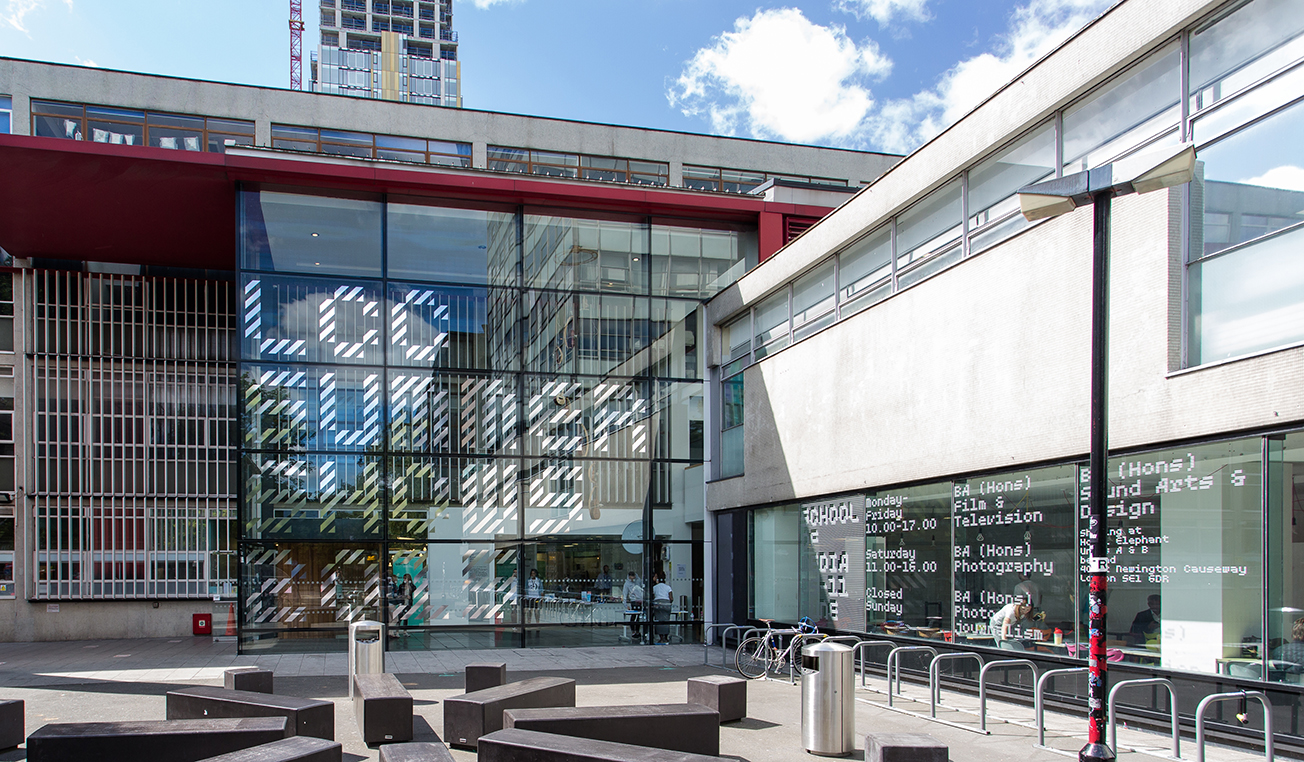
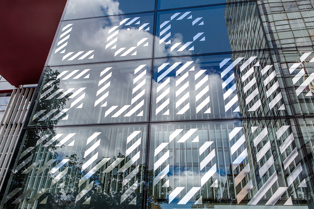
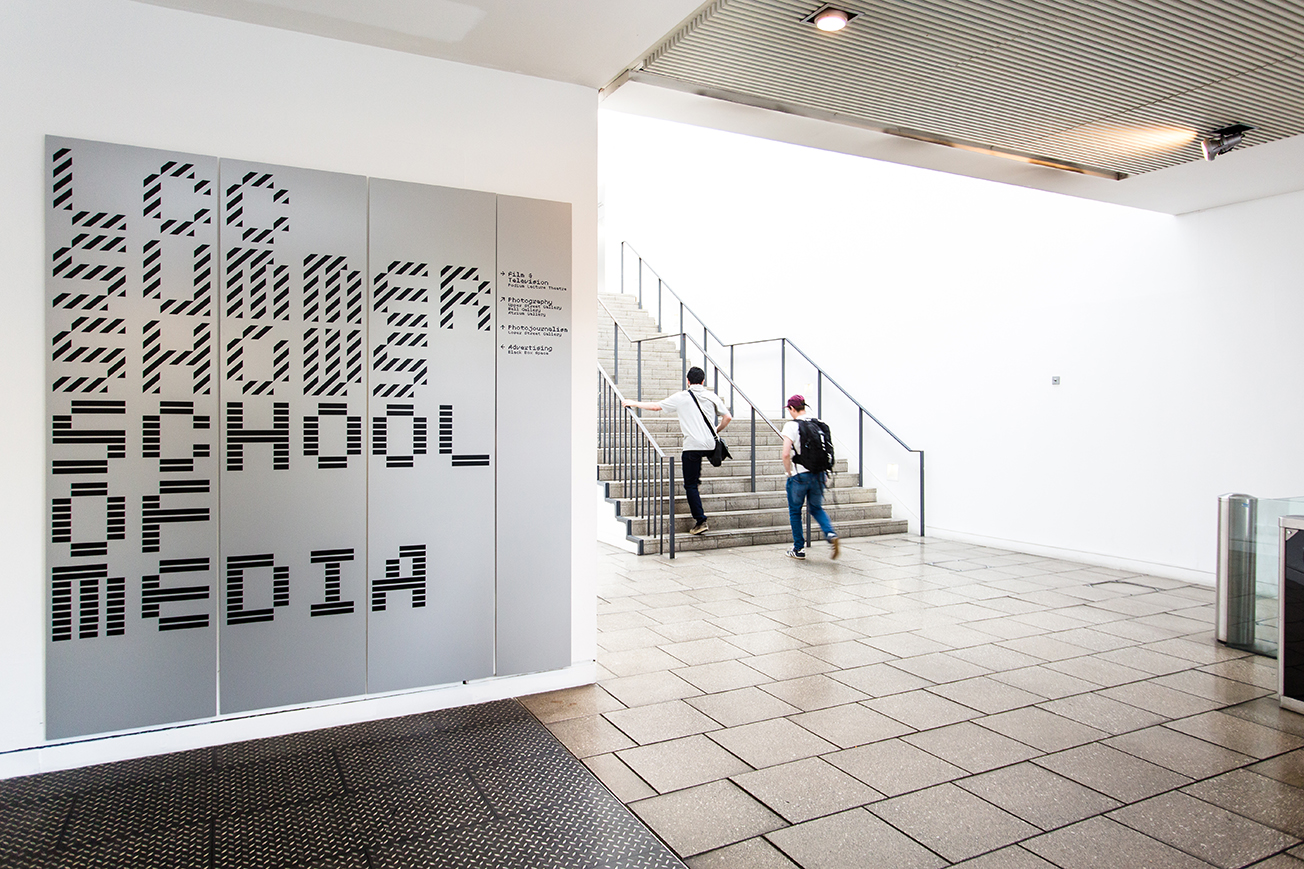
The London College of Communication Summer Shows identity was built with a range of custom typefaces developed from MuirMcNeil TwoPoint. These typefaces have subsequently been revised and expanded and are now part of the
Two Type System, an expansive design space, in which individual glyphs are configured to collaborate with each other harmoniously, and which now includes ten type families / 350+ individual fonts.