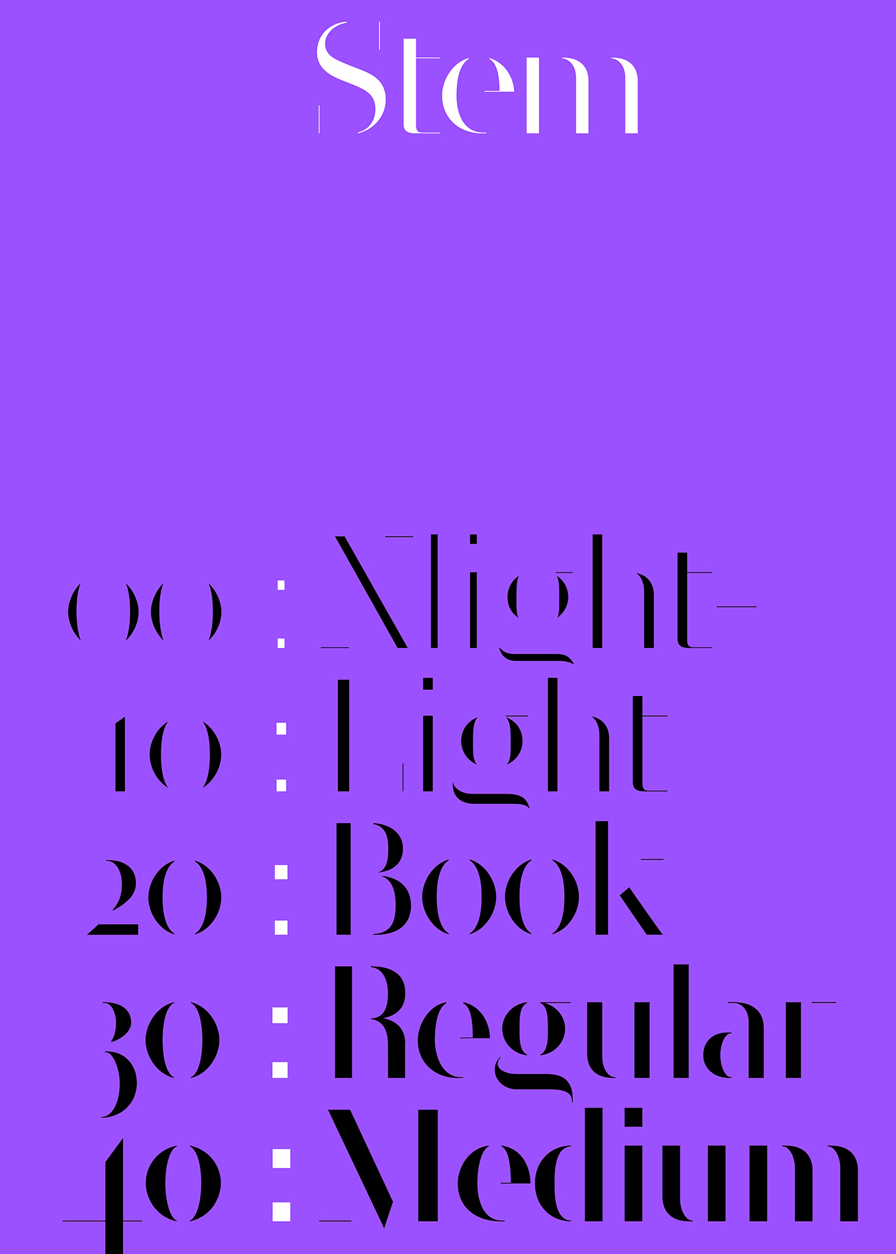
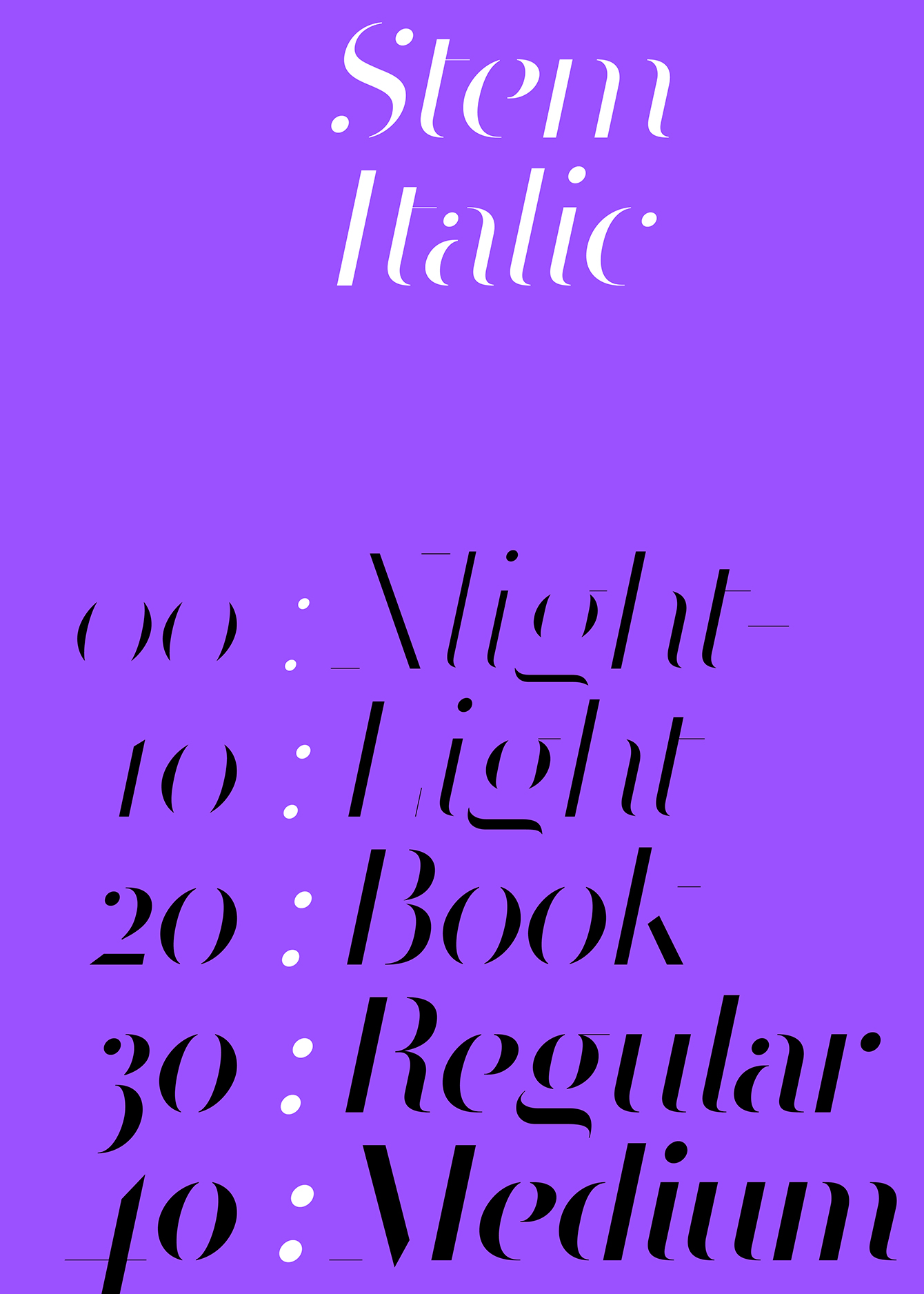
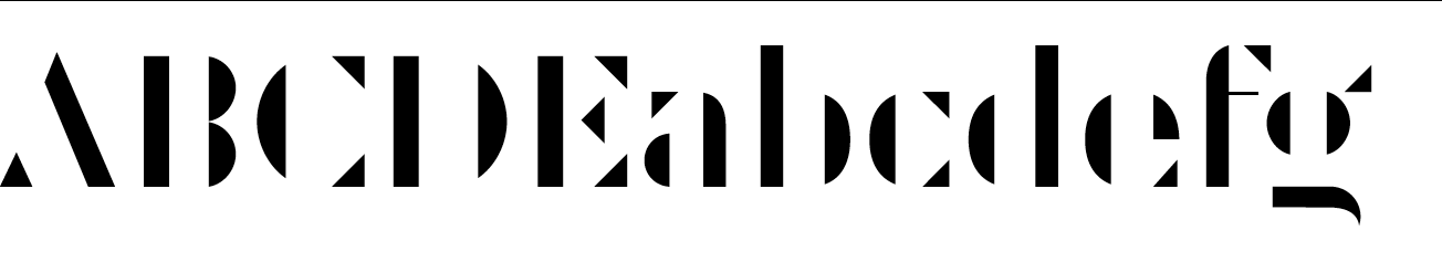
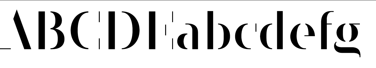
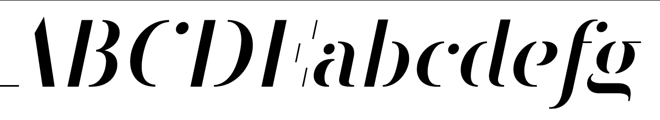
Stem is a display type system that was first published by MuirMcNeil in 2016 as a development of
Cut, a stencil typeface inspired by baroque and modernist designs. In 2020, Stem was revised and expanded as a comprehensive type collection in matching roman and italic styles each drawn in five weights.
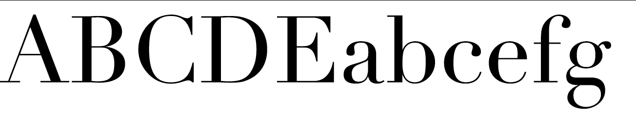
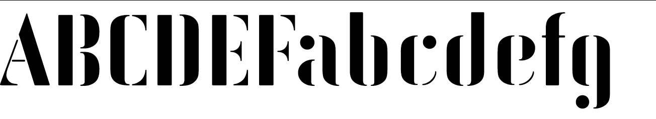
MuirMcNeil Stem is modelled on the shapes and proportions of the radical typefaces produced in the late eighteenth century by typefounders such as Firmin Didot and Giambatista Bodoni. The sharp contours, extreme contrast and vertical axis of these neoclassical types has been taken to an extreme in both Stem variants. In Stem Thin, letterforms are reduced to hairline strokes that dissolve into open intervals, resulting in detached, razor-sharp serifs. It is intended for use in display settings at very large sizes only, whereas Stem Thick features more robust serifs that allow it to be used effectively at smaller sizes.