Published in 2010,
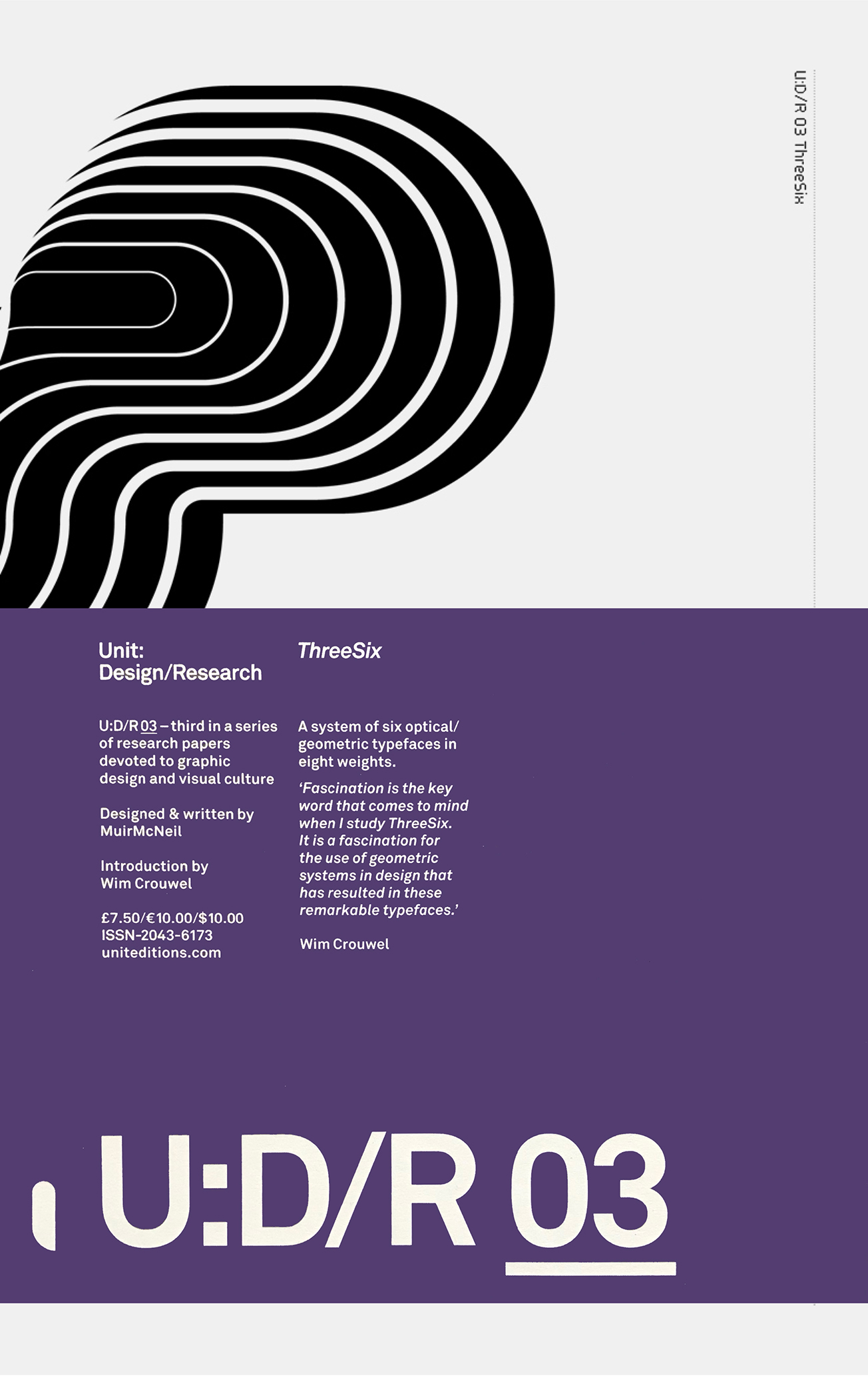
U:D/R 03 ThreeSix was the third in a series of research papers published in tabloid newspaper format (36 x 28.5 cm) by Unit Editions.
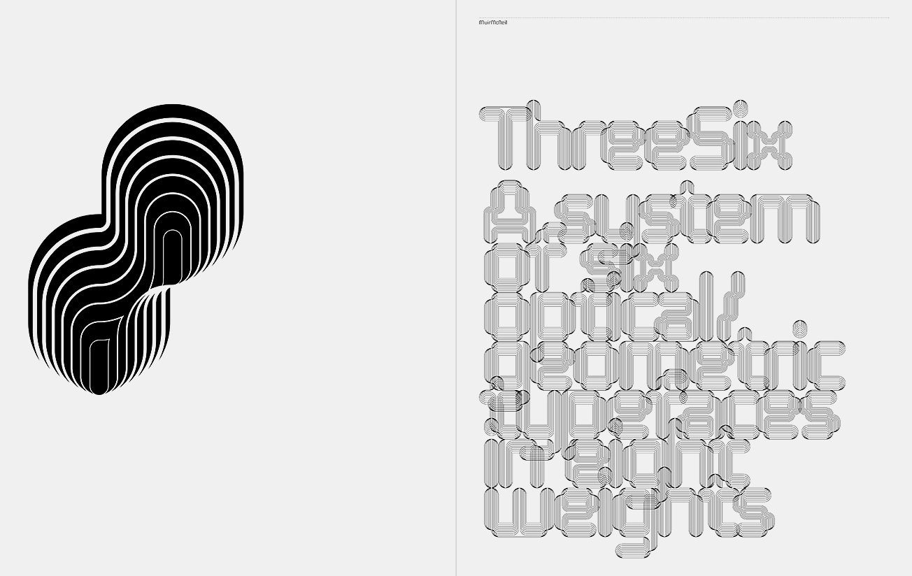
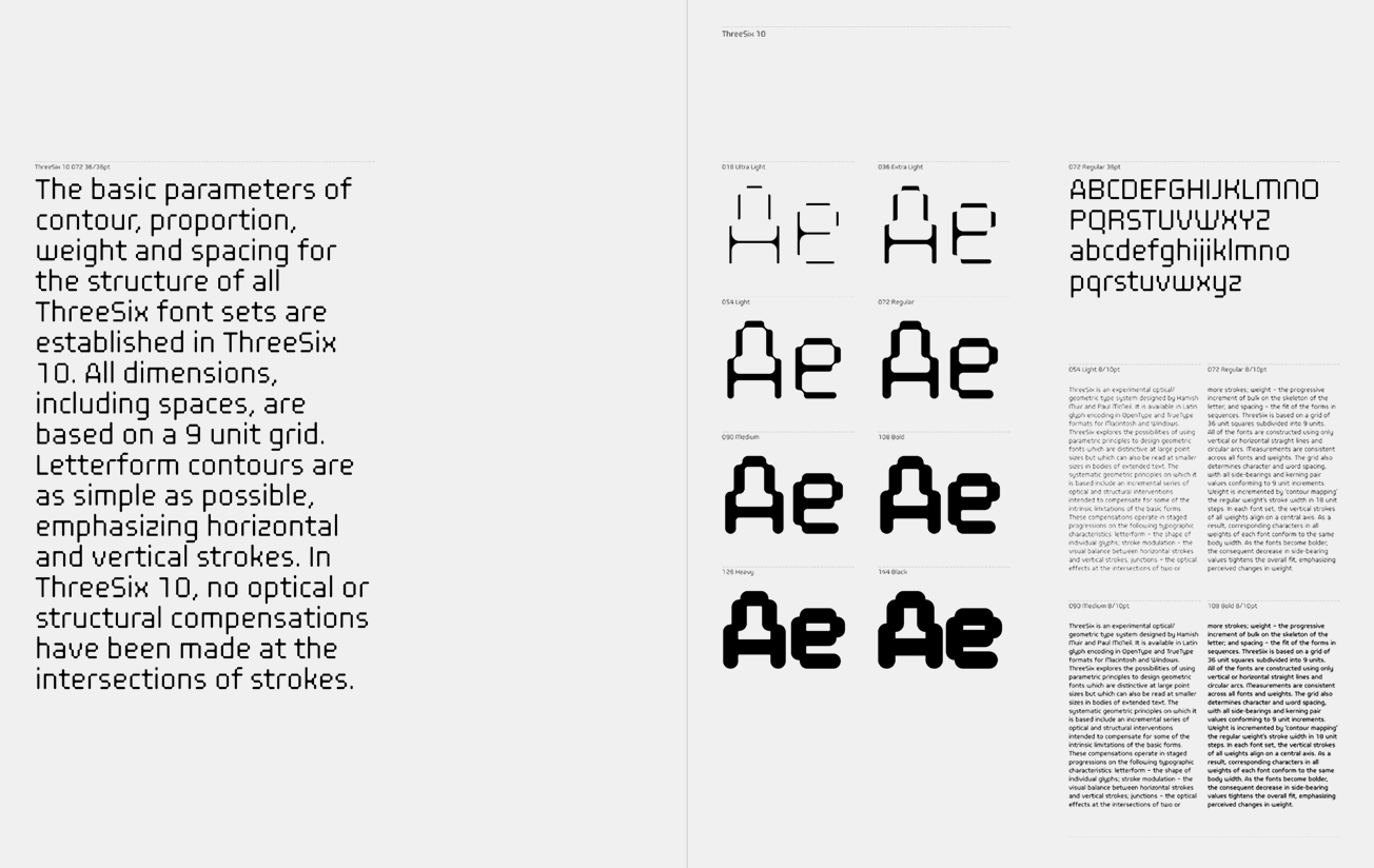
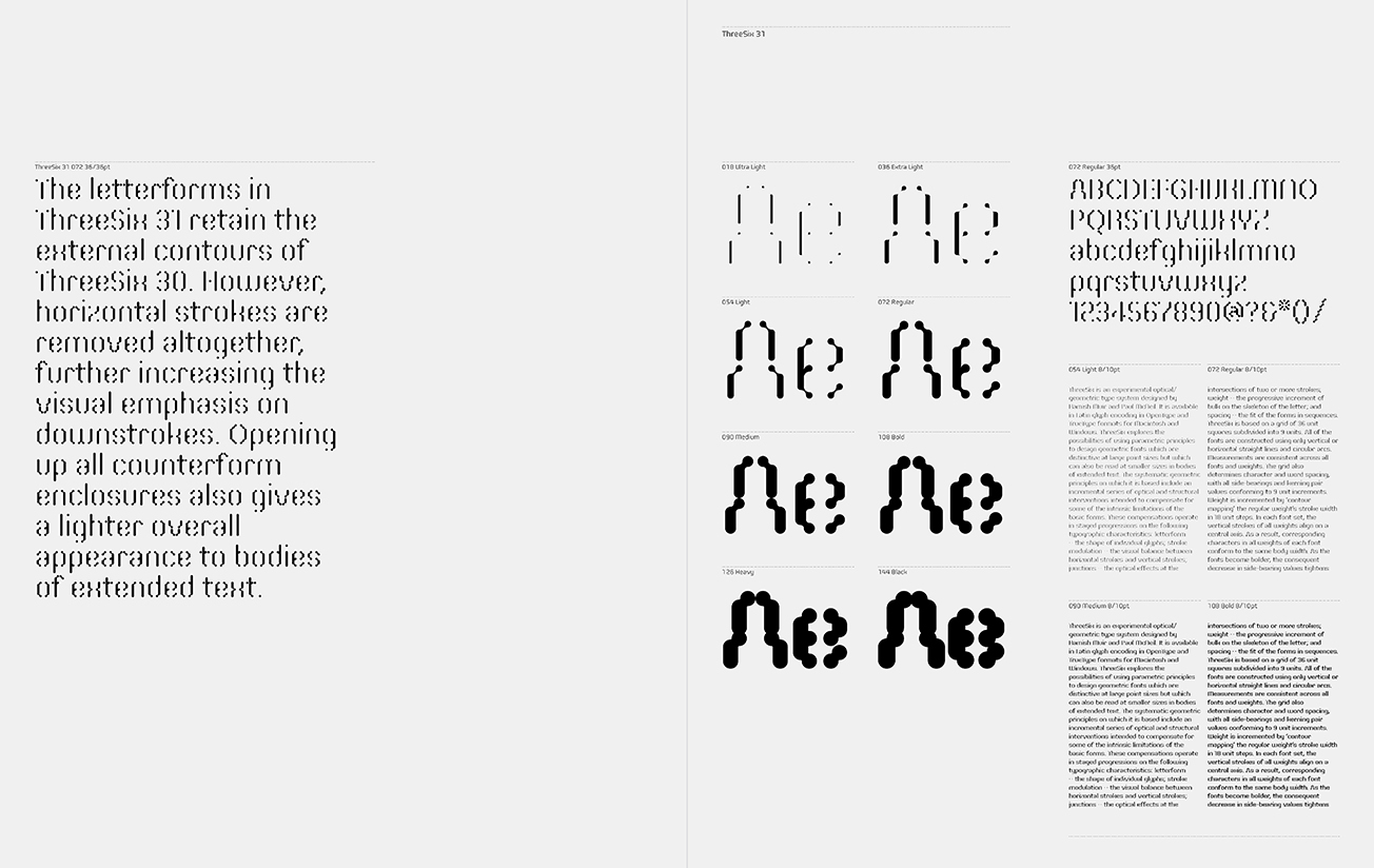
U:D/R 03 was commissioned by Unit Editions co-founder Tony Brook. In 2008, Brook had been invited as guest speaker at the opening of a MuirMcNeil exhibition which documented 'ThreeEight' (the forerunner of ThreeSix), an experimental type system that explored the design of geometric alphabets which are distinctive at large point sizes but which can also be read at smaller sizes in bodies of extended text.
We have a very limited number of copies of U:D/R 03 available to purchase from the MMcN shop