Fluid Identity

TypeCon, the annual convention of the American Society of Typographic Aficionados, is one of the largest and most significant events in the international design calendar. For its 2016 conference in Seattle, MuirMcNeil was invited to design the visual identity.
four-three
In response to the title of the event, Resound, our solution was to produce a modular visual system that would have both impact and coherence across a wide range of applications. Working with a deliberately restricted palette of typographic forms and colours, we developed an extensive series of visual hierarchies that varied as the result of differences in textual content. In individual applications, separate levels of information were emphasized or diminished as required within predefined constraints.
four-three
The visual system was generated using two parametric typefaces and corresponding background panels developed specifically for the project – TwoPoint H and Two Line – which are now part of the Two Type System
four-three
The result of their implementation for TypeCon 2016 was a flexible but instantly recognisable identity whose bright colours, clean geometries and ambiguous relationships of form and counterform playfully engaged with notions of legibility and taste while also reflecting on the modular foundations of traditional and contemporary typographic form-giving.
four-three
four-three
four-three
four-three
Poster Printed offset litho in black and neon green 89x60cm

Very few copies remaining in our shop
four-three
four-three
four-three
Programme. Printed offset litho in black and neon green. 254x110mm.
four-three
four-three
four-three
four-three
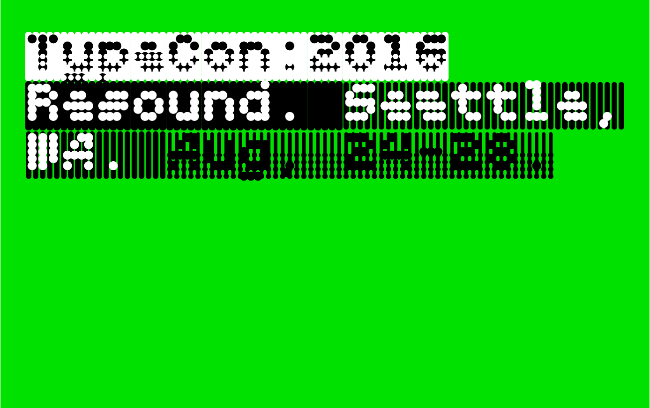
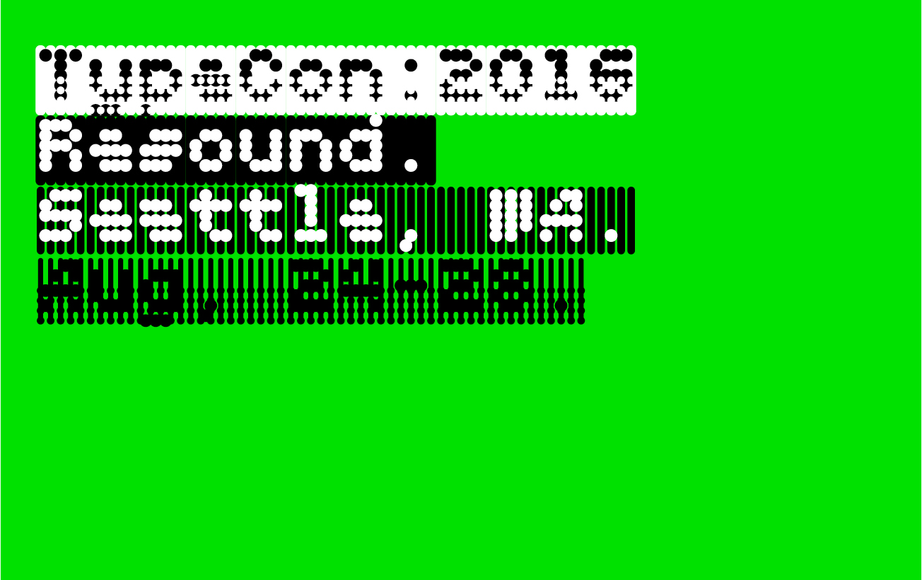
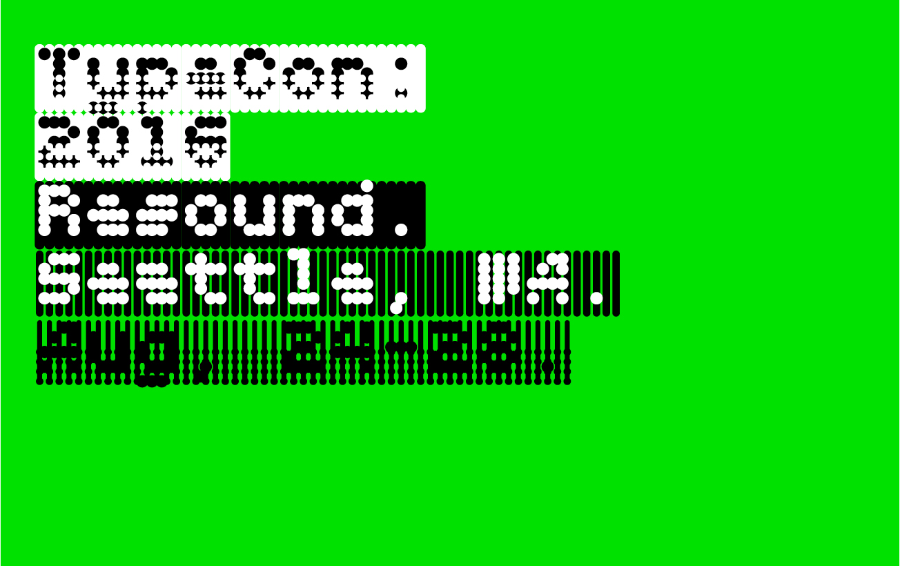
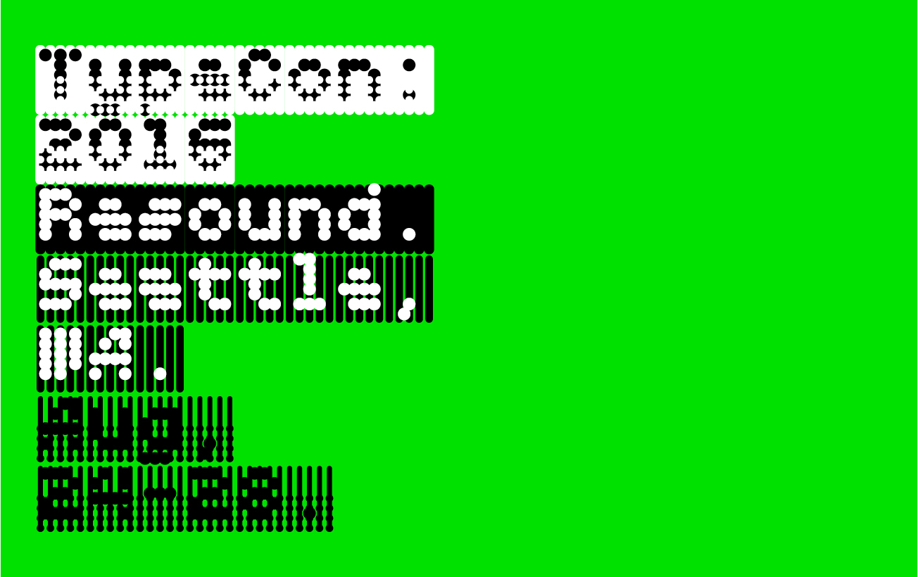
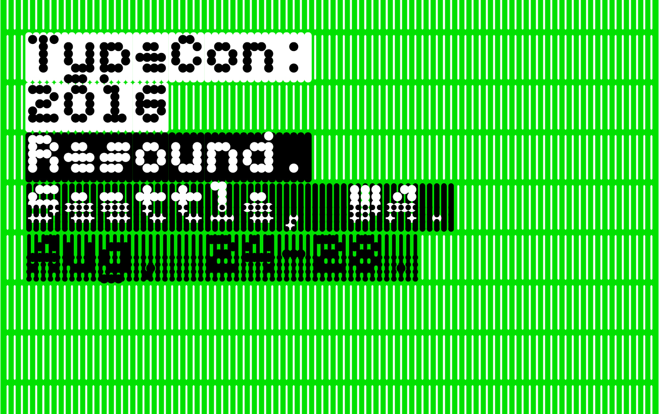
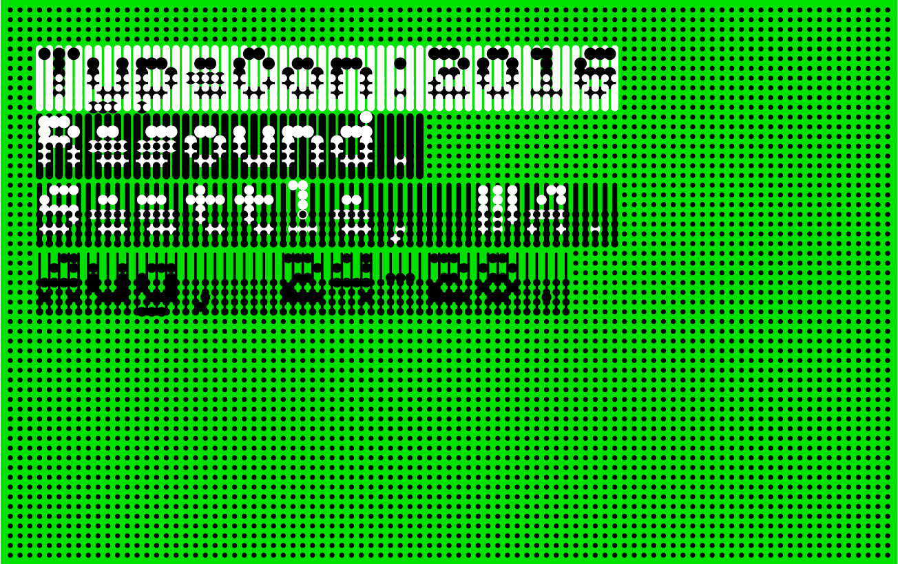
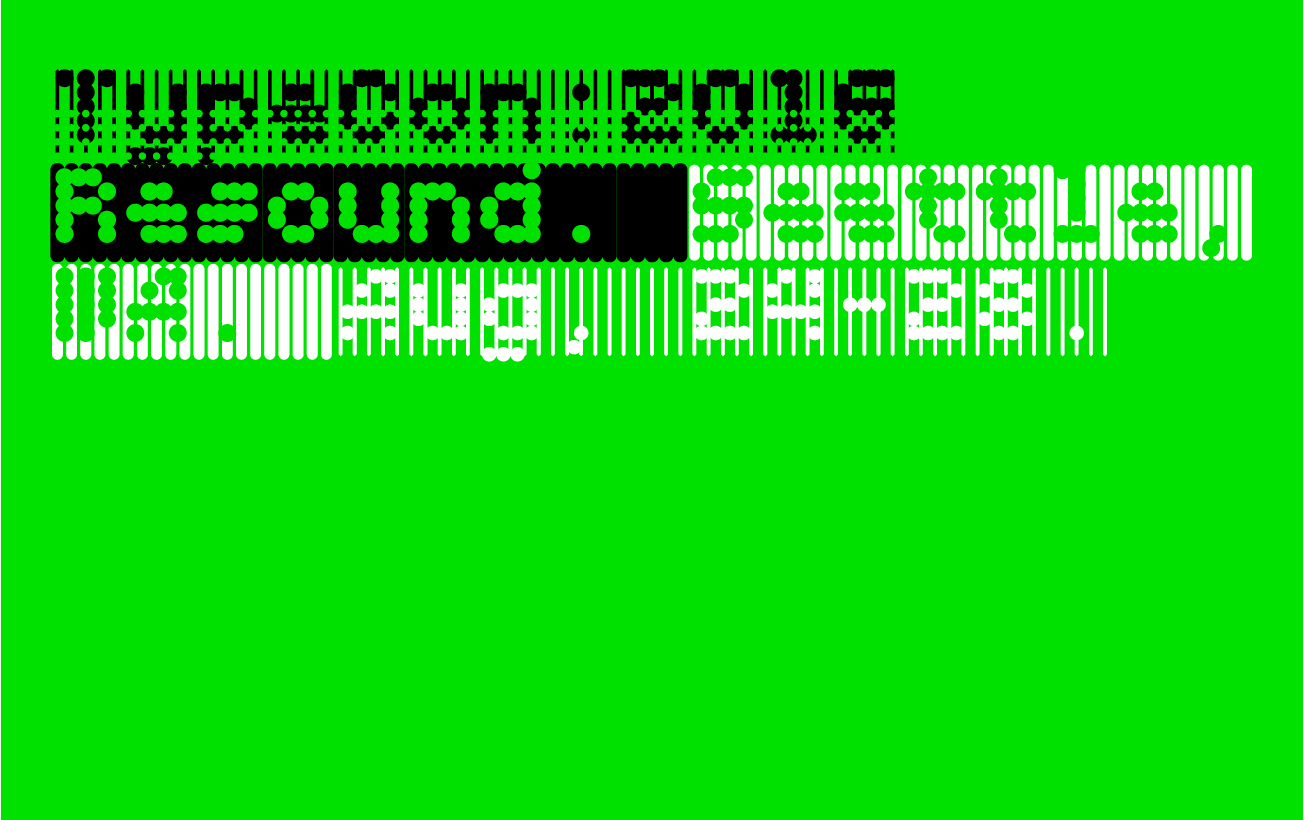
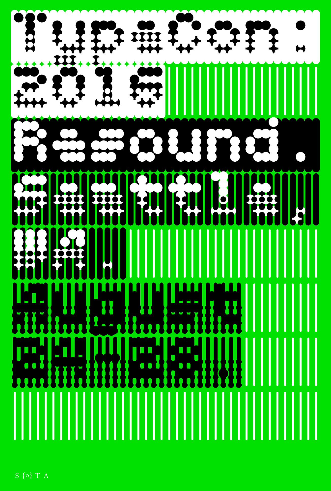
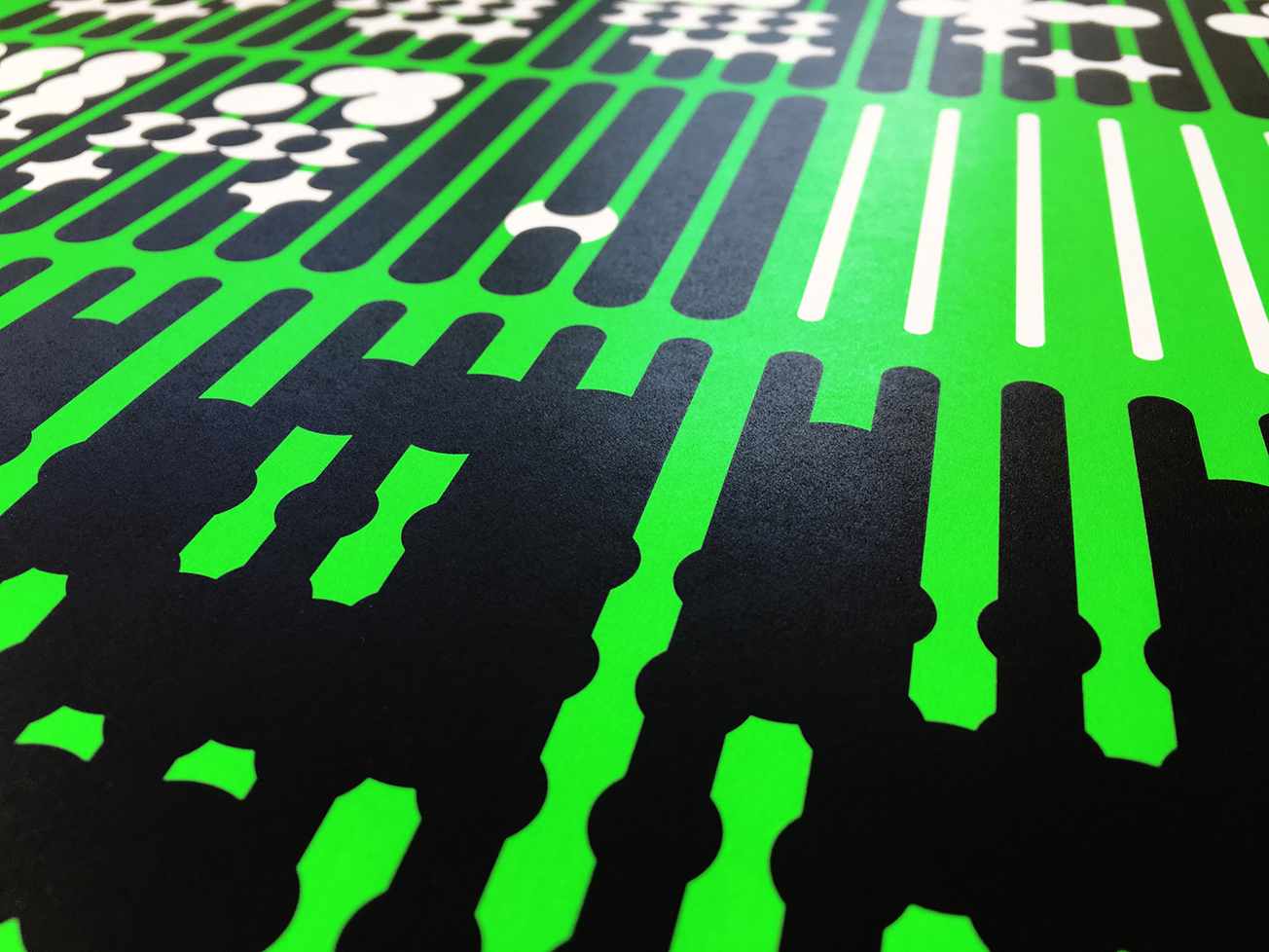
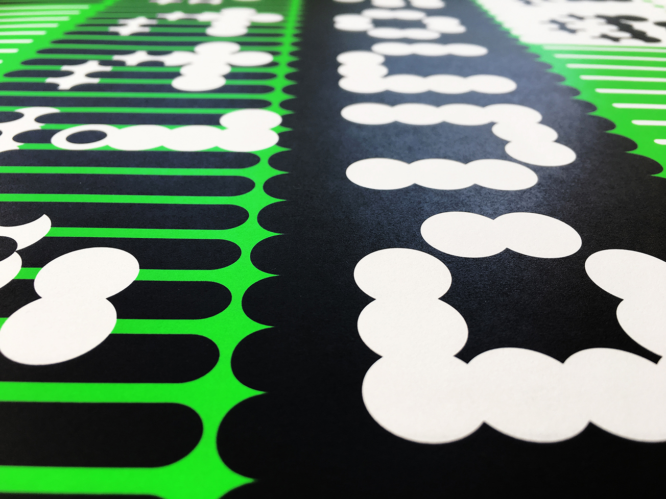
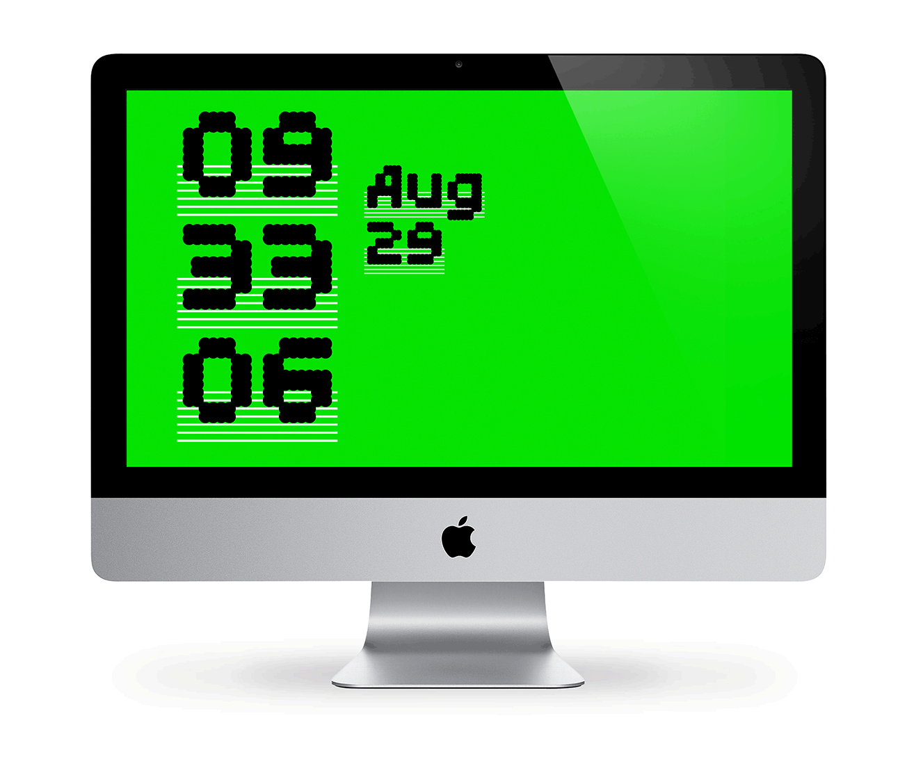
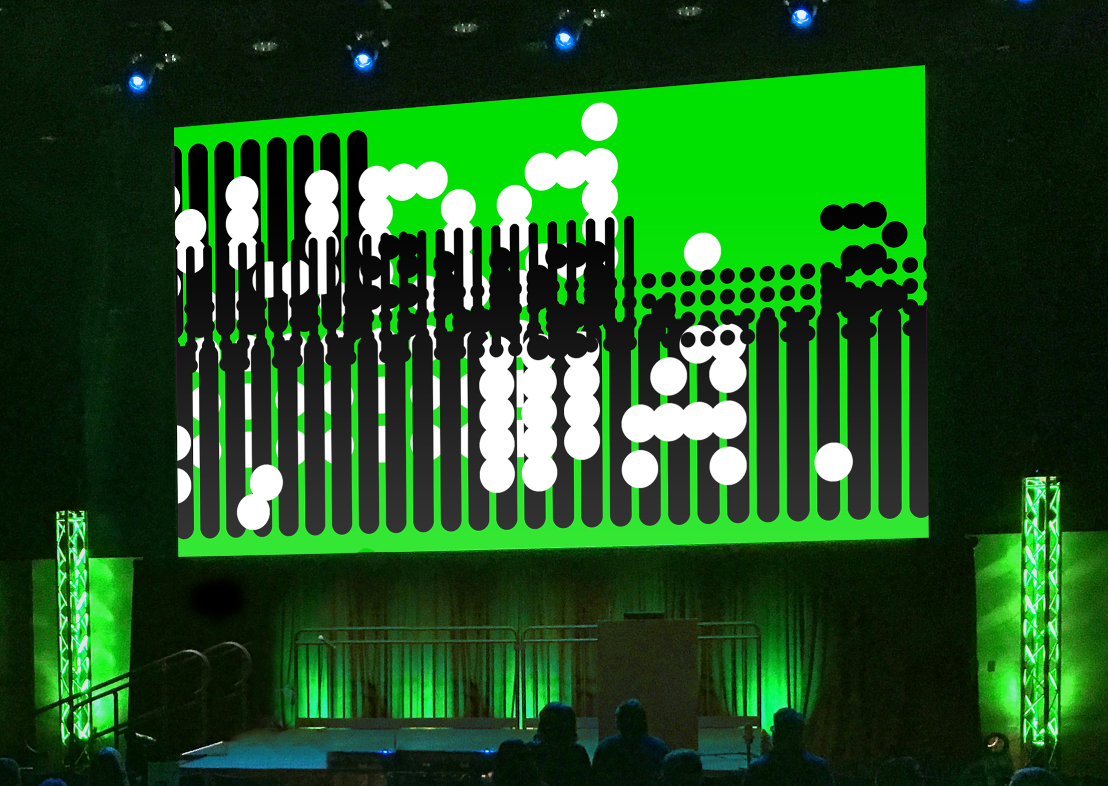
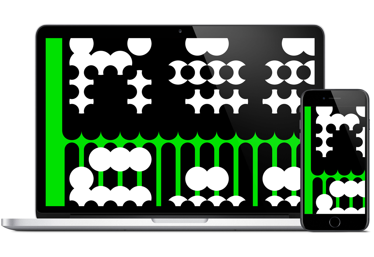
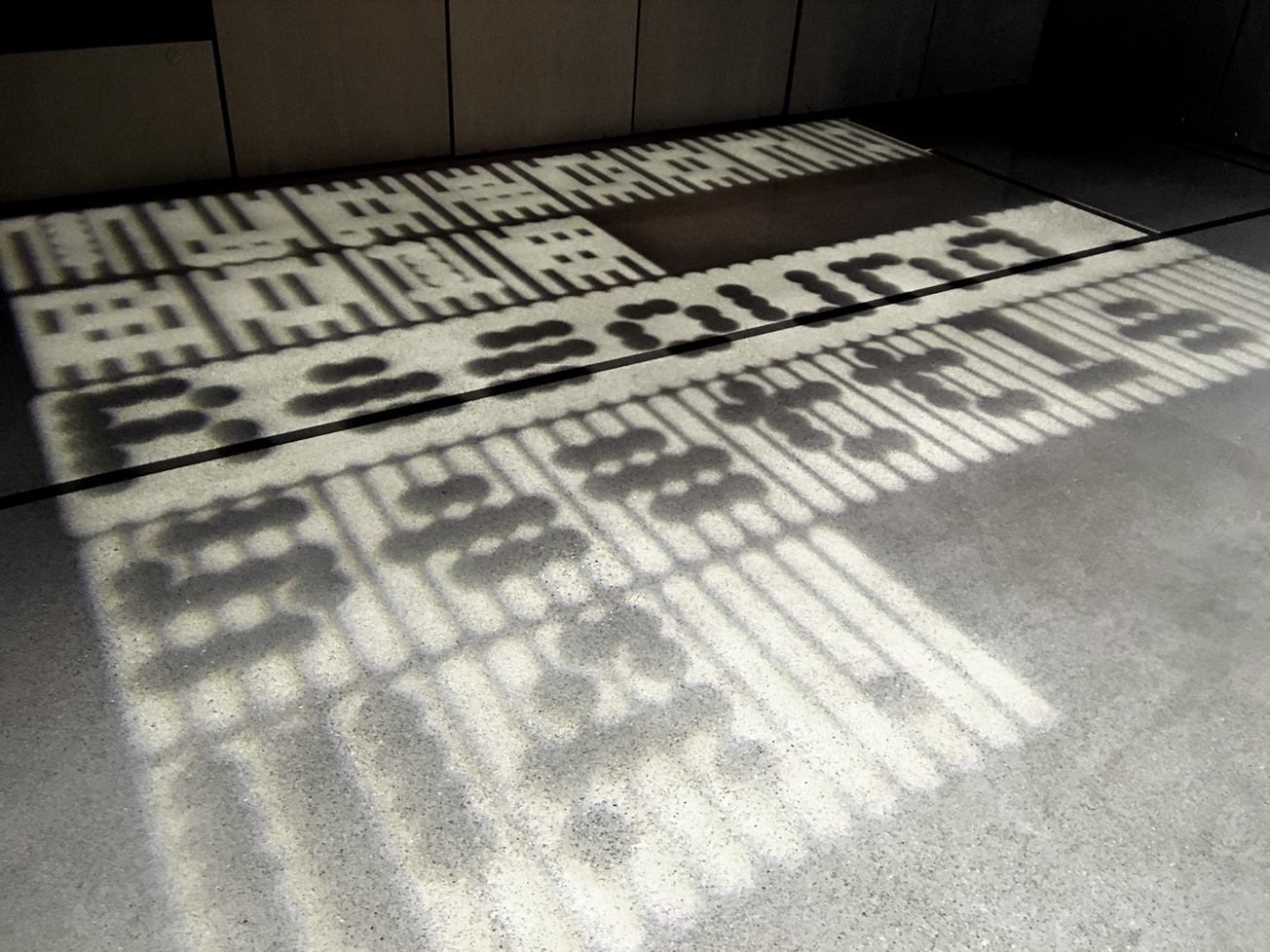
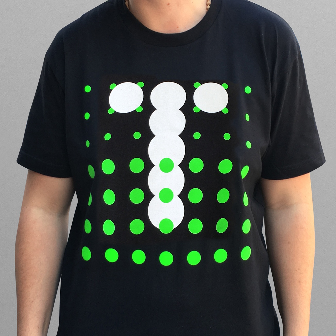
Desktop clock using 66 fonts from the MuirMcNeil Two Type System. In two precisely registered layers, fonts for time, date, and background panels are programmed to change randomly every minute. With layer colours reversing for am and pm, this results in 8,712 possible overlay combinations.
four-three
Conference presentation title frames at the Amazon Doppler Tower, Seattle WA
four-three
four-three
four-three
Intermission video.
The timing of frame motion for text elements, foreground and background panels is programmed in increments proportionate to the dot pitch for each font size used. As a result, the animation is a product of the text content itself.

View on Vimeo
four-three
four-three
Desktop and lock screen
four-three
Conference gobo
four-three
Conference goodies: delegate and volunteer T-shirts, tote bag, postcards, stickers and badges
four-three
four-three
four-three
four-three
four-three
four-three
Process
four-three